
TL;DR
Designers identify specific color palettes—ranging from rich neutrals to deep greens—that can make a home look more expensive. These shades influence perceived quality and sophistication without high costs.
Interior designers have confirmed that choosing the right paint colors can significantly enhance a home’s perceived value and sophistication, often more effectively than costly furnishings.
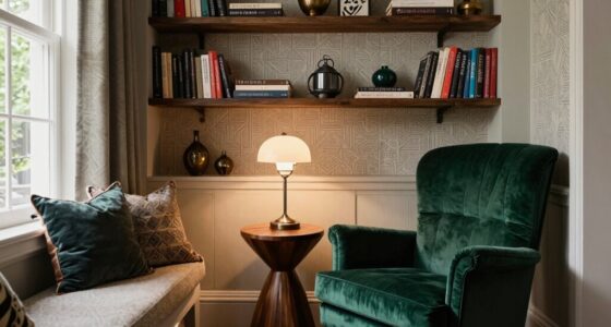
According to experts from Homes & Gardens, certain shades—particularly warm neutrals, deep greens, and off-whites—are associated with an expensive, refined look. Designers highlight that warm, earthy neutrals like Sherwin-Williams’ Renwick Beige provide depth and dimension, creating a calm, boutique hotel-like atmosphere. Deep olive greens, such as Sherwin-Williams Ripe Olive, are also recommended for their rich, jewel-toned quality that pairs well with natural materials.
Light, off-white shades like Benjamin Moore’s Cloud Cover are favored for their ability to make spaces feel airy and inviting. Experts emphasize layering different sheens and textures—such as matte walls with satin trims—to add complexity and sophistication. These color choices are adaptable across various rooms, from bedrooms to living areas, and can be incorporated through paint or decor elements like wallpaper and textiles.
Why It Matters
This insight matters because it provides homeowners and designers with cost-effective ways to elevate the look of a space. By selecting specific hues, it is possible to create an impression of luxury and quality without expensive renovations or furnishings. These color strategies can influence buyer perception, increase a home’s appeal, and foster a more refined living environment.

Oslo Home Touch Up Paint, 20ml, Matte, Comparable Match of Sherwin Williams Kilim Beige
- Color Match Technology: Comparable to Sherwin Williams Kilim Beige
- Brand Independence: Not affiliated with Sherwin Williams
- Quick Repair Solution: Restores walls in minutes
As an affiliate, we earn on qualifying purchases.
As an affiliate, we earn on qualifying purchases.
Background
The idea that color impacts perceived value is supported by longstanding interior design principles. Recent expert opinions reinforce that neutral and deep tones are trending for their timeless appeal and ability to convey sophistication. This advice aligns with broader design trends favoring calm, natural palettes and layered textures.
“The layered undertones of deep, enveloping tones create depth and dimension, making a space feel intimate and elevated, similar to a boutique hotel.”
— Mallory Robins, Kobel + Co
What Remains Unclear
While these color recommendations are widely supported by designers, individual preferences and lighting conditions can influence how hues appear in different spaces. Specific shades may vary in effect depending on room size, natural light, and furnishings, and no single color guarantees an expensive look.
What’s Next
Homeowners and designers are expected to experiment with these palettes in upcoming projects, potentially combining these hues with textures and decor for maximum impact. Future trends may also explore new shades or combinations that continue to elevate home aesthetics.
Key Questions
Can color alone make a house look more expensive?
Color plays a significant role, but overall perception also depends on lighting, decor, and furnishings. The right palette enhances the sense of luxury when combined with thoughtful design.
What are the best neutral shades for an expensive look?
Warm, earthy neutrals like beige, taupe, and off-white shades such as Benjamin Moore’s Cloud Cover are highly recommended for their sophisticated and calming effect.
Are dark colors suitable for small rooms?
Yes, deep hues like olive green or navy can create a luxurious feel even in small spaces, especially when layered with warm textures and proper lighting.
How can I incorporate these colors without painting?
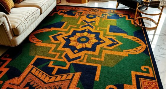
Colors can be introduced through decor elements like wallpaper, textiles, rugs, and accessories, offering a flexible way to achieve an elevated look.
Source: Homes & Gardens