Using bold color pairings and contrasts in interior design can instantly transform your space into a vibrant, eye-catching environment. By combining complementary, analogous, or triadic schemes, you create visual interest and harmony that reflect confidence and creativity. Think about contrasting deep navy with vivid coral or white with emerald green to add energy and focus. Balancing these bold choices guarantees your space feels lively but not chaotic. Keep exploring to reveal more ideas for stunning color contrasts in your interiors.
Key Takeaways
- Use complementary, analogous, or triadic color schemes to create harmonious yet striking bold pairings in interior design.
- Incorporate contrasting colors like navy and coral or white and emerald green to add vibrancy and visual interest.
- Balance bold contrasts with neutral backgrounds to prevent visual clutter and maintain a cohesive space.
- Employ contrasts strategically to highlight focal points such as accent walls, furniture, or decorative features.
- Consider the psychological effects of color to evoke desired moods—energizing or calming—when using bold pairings.
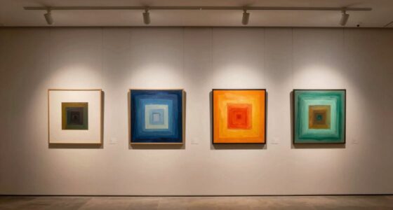
Have you ever wondered how to make your outfits stand out effortlessly? The secret often lies in understanding the power of color, especially when you use bold pairings. In interior design, this concept translates into color blocking and contrasts, which create striking visual effects that grab attention without much effort. When you select your color schemes, it’s helpful to consider famous color schemes—like complementary, analogous, or triadic combinations—since these are proven to work harmoniously and generate dynamic visual interest. These schemes are rooted in color theory and have been used by designers for generations, making them reliable choices for creating impactful spaces. Beyond aesthetics, the psychological effects of color play a significant role in how a room feels and functions. Bright, warm hues like red or yellow can energize a space, fostering excitement and warmth, while cooler shades like blue or green promote calmness and relaxation. Using bold color pairings thoughtfully allows you to influence emotions and set the tone of a room simply by how you combine hues.
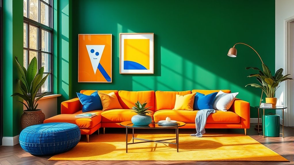
When you mix contrasting colors, you create a sense of vibrancy and movement that makes a space feel lively and engaging. Think about pairing a deep navy with a vivid coral or a crisp white with a bold emerald green—these combinations not only catch the eye but also evoke specific feelings. The key is balancing these contrasts so they complement rather than clash. For example, if you choose a bright yellow, pair it with a muted gray or charcoal to prevent overwhelming the senses. This balance ensures your space feels energetic but not chaotic. Using contrasts also allows you to highlight particular areas or features within a room, drawing attention to art, furniture, or architectural details. Additionally, incorporating sustainable building materials can enhance the eco-friendly appeal of your design choices, aligning with a growing trend toward environmentally conscious living.
In addition, bold pairings can serve as focal points, transforming simple rooms into statement spaces. You don’t need to cover every surface with contrasting colors; instead, strategically select accent walls, furniture, or decor items that pop against more neutral backgrounds. This approach keeps the space feeling harmonious while emphasizing your personal style. Remember, the psychology of color influences how you and others experience your environment—so choose your combinations with intention. Whether you want a room that energizes or soothes, bold color blocking and contrasts give you the tools to craft spaces that are both visually compelling and emotionally resonant. When you master these techniques, your interiors will reflect confidence and creativity, making every room uniquely yours.
EVOLVE Interior Paint & Primer, Eggshell (Ivy Green), 1 Gallon – One-Coat Coverage, Excellent Hide, Low VOC, Low Odor, Washable Paint for Walls, Doors & Trim
- Paint and Primer in One: Provides coverage and surface sealing
- Multiple Sheens and Colors: Available in various finishes and shades
- Eggshell Sheen: Soft, velvety glow with durability
As an affiliate, we earn on qualifying purchases.
As an affiliate, we earn on qualifying purchases.
Frequently Asked Questions
How Can I Incorporate Color Blocking Into Small Spaces Effectively?
To incorporate color blocking effectively in small spaces, use bold color pairings strategically as a space-saving strategy. Focus on painting one accent wall or furniture piece with a contrasting color to create visual interest and the illusion of more space. Keep other elements neutral to avoid clutter, and use contrasting colors in accessories or textiles. This approach enhances your space’s depth and brightness while maintaining a cohesive, stylish look.
What Are Common Mistakes to Avoid With Bold Color Contrasts?
They say “less is more,” and it truly applies to bold contrasts. Avoid clashing patterns and oversaturated palettes, which can overwhelm your space. Stay mindful of color proportions, and don’t forget that too much contrast can create chaos rather than harmony. Keep your palette balanced and make sure your bold choices complement each other. When in doubt, step back and see if the contrast feels lively or just noisy.
Which Color Combinations Are Best for Creating a Calming Effect?
You should opt for muted tones and soothing palettes to create a calming effect. Light blues, soft greens, and gentle beiges work well together, providing a tranquil atmosphere. Avoid overly bright or contrasting colors, which can disrupt relaxation. Instead, focus on harmonious combinations that promote serenity. Incorporate these muted tones in walls, textiles, and accessories to craft a peaceful, inviting space that helps you unwind.
How Do Lighting Choices Impact the Appearance of Color Blocking?
Lighting choices can totally transform your color blocking scene — it’s like magic! Your lighting ambiance and fixture selection can make bold colors pop or fade into the background. Bright, warm lights amplify vivid hues, making them feel energetic and lively. Soft, cool lighting creates a calming, sophisticated vibe by muting contrasts. So, pick your fixtures wisely; they’re the secret sauce for turning your color blocking from eye-catching to jaw-dropping!
Can Color Blocking Be Adapted for Outdoor or Seasonal Decor?
Yes, you can adapt color blocking for outdoor or seasonal decor. Incorporate seasonal color palettes to keep your space fresh and vibrant, and use bold pairings to create striking visual interest. Enhance your outdoor area with colorful furniture accents, cushions, or umbrellas that highlight contrasting hues. This approach adds energy and personality, making your outdoor space inviting and dynamic throughout different seasons.
Conclusion
As you explore bold color pairings, remember that sometimes, the perfect contrast appears unexpectedly—like a chance encounter that sparks inspiration. Embrace these surprises, for they remind you that harmony often arises from contrast. When you incorporate color blocking thoughtfully, you create spaces that feel both intentional and alive, showing that even in the chaos, there’s a hidden rhythm. Trust the process, and let these bold choices subtly reflect the beautiful unpredictability of your personal style.