
Pattern clashing with bold rugs and graphic walls creates a stunning focal point in your space. To make it work, choose one dominant pattern and balance it with contrasting or complementary designs. Play with textures, colors, and scales without overwhelming the room, and keep other decor simple. Incorporate visual rhythm and balance to create harmony. If you want expert tips and ideas, there’s plenty more to explore about mastering this dynamic interior style.
Key Takeaways
- Choose one dominant pattern to anchor the space and add smaller, contrasting patterns for visual interest.
- Balance bold rugs with graphic walls by keeping other decor simple and neutral to prevent overwhelming the room.
- Use varied textures and finishes to create depth without clashing visually.
- Maintain a cohesive color palette to unify patterns and prevent chaos.
- Highlight the graphic wall with strategic lighting to enhance the pattern clash as a focal point.
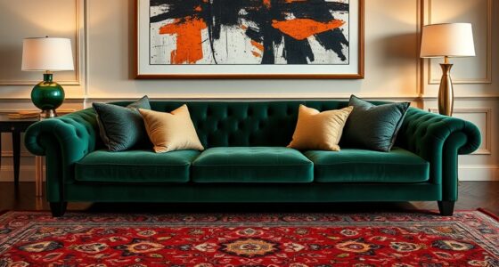
Embracing the Art of Contrast in Interior Design
When it comes to interior design, embracing contrast can transform a space from ordinary to striking. You create visual rhythm by balancing different patterns, colors, and textures, making every element stand out. Texture harmony is key—combine smooth surfaces with rougher ones to add depth and interest. For example, pairing a sleek, graphic wall with a plush, patterned rug enhances the tactile experience and keeps your eye moving across the room. Don’t shy away from mixing bold patterns; instead, use contrast intentionally to highlight each piece. This approach keeps the space lively and engaging while maintaining cohesion. Additionally, incorporating diverse textures can also inspire creativity in home decor by encouraging innovative pairings. Understanding the impact of contrast ratio on visual clarity and depth can further elevate your design choices. Recognizing how pattern mixing influences personal aesthetics can subtly guide your style decisions. Ultimately, mastering contrast through texture harmony and visual rhythm elevates your interior from plain to memorable, capturing attention and sparking curiosity.
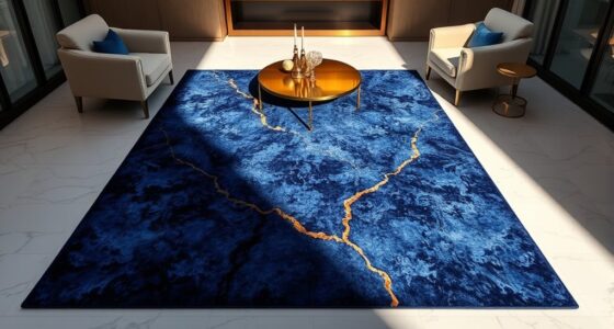
Choosing the Perfect Rug to Make a Statement
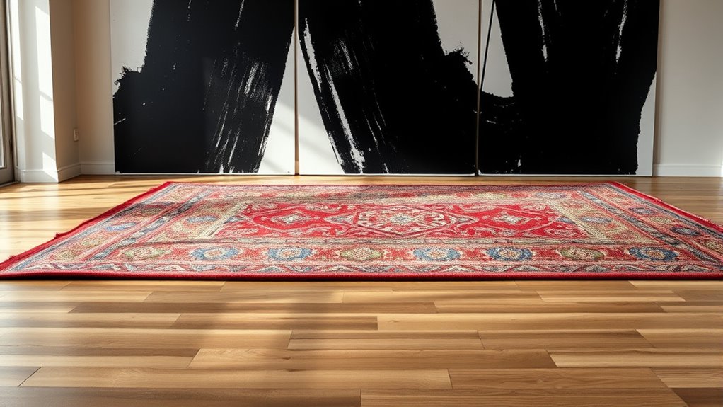
Ever wondered how the right rug can instantly elevate your room’s style? Choosing a rug with layered textures and bold pattern pairing creates visual interest and depth. Look for a rug that complements your wall design while adding contrast. Focus on selecting patterns that either contrast or harmonize, depending on your desired effect. A statement rug anchors your space and guides the eye. Consider these tips:
- Opt for textured rugs to add tactile richness
- Pair large-scale patterns with simpler walls for balance
- Mix different textures for a layered, sophisticated look
- Use contrasting colors to make your rug stand out
- Incorporate vintage decor elements to enhance the farmhouse charm and create a cohesive aesthetic.
- Pay attention to the beach town influences that can inspire a relaxed, coastal vibe in your design.
- To achieve a cohesive look, consider how symbolism in art and decor can subtly reinforce your chosen theme and add meaningful depth to your space.
- Additionally, understanding how layered textures can add dimension helps you craft a more dynamic and inviting environment.
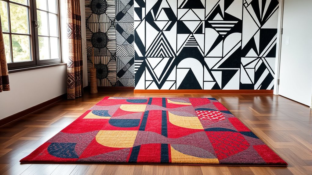
Selecting a Graphic Wall for Maximum Impact
Looking to make a bold statement in your space? Choosing the right graphic wall can transform your room instantly. Opt for a color palette that contrasts with your bold rug and patterned furniture to create visual interest. Think about incorporating black and white graphics for a striking, modern look, or go for vibrant hues if you want energy and warmth. Lighting techniques also play a pivotal role—use directional lighting to highlight the wall’s graphic details or soft ambient light to enhance the overall atmosphere. Avoid overwhelming the space by keeping other decor simple, allowing the graphic wall to be the focal point. When you combine a carefully selected color palette with strategic lighting, your wall becomes a powerful statement piece that elevates your entire room. Wall organization can also be integrated to keep the space tidy and visually appealing. Additionally, incorporating unique and wicked planters can add an unexpected element of interest and creativity to your interior design. Understanding how interior decor influences the ambiance can help you create a cohesive and inspiring environment.
Balancing Patterns and Colors for Cohesion

Achieving a cohesive look requires carefully balancing patterns and colors so they complement rather than compete with each other. Focus on establishing strong color harmony by selecting hues that work well together, avoiding clashes that disrupt flow. Scale coordination is essential—larger patterns should be balanced with smaller, more subdued elements to prevent visual overload. To refine your design, consider these tips:
Balance patterns and colors with harmony and scale for a cohesive, visually pleasing design.
- Use a neutral color palette as a unifying base to anchor bold patterns
- Mix patterns of varying scales to create visual interest without chaos
- Limit your color palette to a few key shades for consistency
- Balance busy patterns with simpler, solid-colored elements for harmony
- Incorporate an understanding of pattern balance to ensure visual harmony across your space. Additionally, understanding visual weight can help you distribute patterns more effectively for a balanced aesthetic, especially when considering relationship dynamics between different design elements. Recognizing how Honda Tuning principles such as suspension upgrades and color coordination can inspire a more harmonious and balanced approach to pattern and color mixing in interior design.
Tips for Mixing Different Styles and Textures

Once you’ve balanced patterns and colors, adding different styles and textures can elevate your design further. Incorporate textured fabrics like velvet, boucle, or woven materials to create depth and tactile interest. Mixing these with smooth surfaces prevents your space from feeling flat. Metallic accents, such as brushed gold or silver accessories, add a touch of sophistication and contrast nicely with softer textures. When combining styles, focus on harmony—pair modern furniture with vintage textiles, for example, to create a curated look. Keep a neutral base to anchor diverse textures and styles, allowing each element to stand out without overwhelming the space. Additionally, understanding the importance of local resources and tools can help you discover unique pieces that enhance your layered, dynamic environment, making your space both visually engaging and cohesive. Recognizing the value of diverse design elements allows for more creative and personalized interior styling, especially when considering the variety of textures and materials available to create a richly layered aesthetic. Consulting with local retailers and service providers can further assist in sourcing the perfect accents and materials to complete your design.
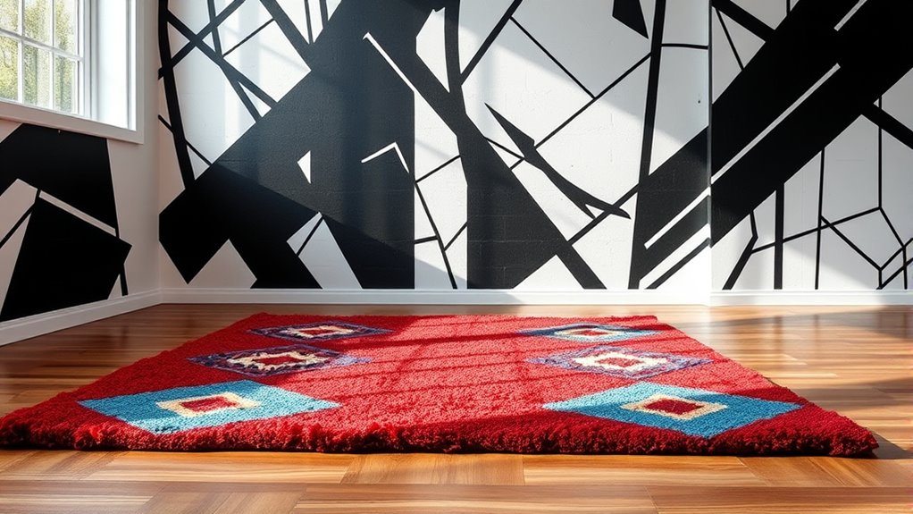
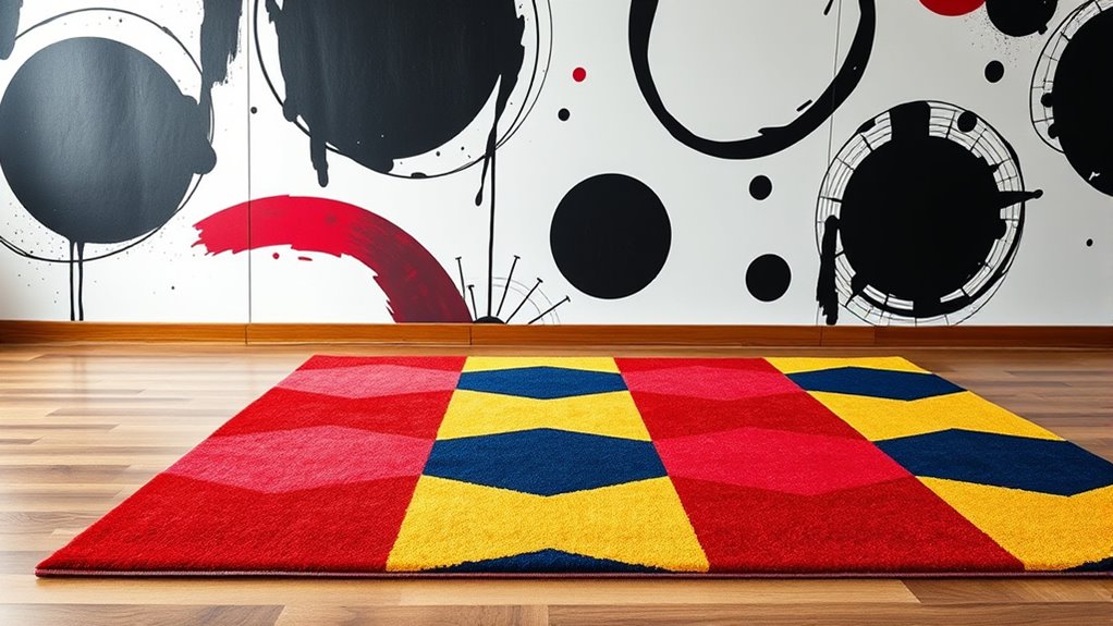
Creating Focal Points With Pattern Clashing

Creating focal points with pattern clashing draws the eye and energizes a space by intentionally pairing bold, contrasting patterns. To achieve this, consider textile layering—overlapping rugs, cushions, or curtains with varying patterns creates depth and visual interest. Color blocking helps anchor the look, providing a cohesive foundation amid lively clashes. Focus on one dominant pattern to guide the eye, then add complementary or contrasting patterns for impact. Use pattern clashing strategically to highlight artwork or architectural features, turning them into focal points. Balance is key; too much chaos can overwhelm. Keep textures varied but harmonious, ensuring each element enhances the overall design without competing. Incorporating visual harmony principles can help you feel confident in experimenting with bold designs, knowing you can create a comfortable and inspiring environment. Cybersecurity vulnerabilities during such bold design choices highlight the importance of understanding digital safety in all aspects of life. Thoughtful pattern clashing transforms your space into an engaging, stylish statement.
Avoiding Overwhelm: Tips for Subtle Balance

To keep your pattern clashes feeling balanced, start with neutral tones that won’t overwhelm the space. Limit the number of patterns you mix so each one can stand out without competing. This simple approach helps create a subtle, cohesive look that feels intentional and calm.
Use Neutral Tones
Using neutral tones can effectively create a calming and balanced atmosphere without overwhelming the senses. A neutral palette, featuring subdued tones, provides a sophisticated backdrop that complements bold patterns. It helps your space feel cohesive and avoids visual clutter. To enhance this effect, consider these tips:
- Incorporate shades like beige, taupe, or soft gray for walls and larger furniture pieces.
- Use subtle textures and finishes to add depth without competing with statement patterns.
- Balance bold rugs with understated accessories in similar neutral hues.
- Keep color gradations smooth to maintain a seamless, harmonious look.
- Additionally, understanding how spoiled lemon juice shows signs of spoilage can help you keep your ingredients fresh and safe for your design-inspired space.
Limit Pattern Mixes
When working with multiple patterns, it’s vital to limit their use to prevent your space from feeling busy or chaotic. Focus on pattern layering with a minimalist contrast to create a balanced look. Choose one dominant pattern and keep others subtle, such as a small-scale print or a plain texture. This approach guarantees your patterns complement rather than compete with each other. Avoid overwhelming your space by sticking to just two or three patterns, ideally in different scales or textures. Incorporating neutral tones can also help soften the overall effect. Remember, less is more when it comes to pattern mixing. By carefully selecting and limiting your pattern combinations, you create a cohesive, stylish environment without clutter or visual fatigue.
Examples of Stunning Pattern Clashing in Modern Spaces

Stunning pattern clashing transforms modern spaces into dynamic visual statements that captivate the eye. You’ll notice how textile layering creates depth, blending diverse patterns seamlessly. Skillful color pairing is essential; contrasting hues can energize a room or add harmony. In contemporary interiors, bold rugs paired with graphic walls showcase this concept vividly. The key is balancing scale and style to avoid chaos. Here are some inspiring examples:
Pattern clashing adds vibrant depth and energy to modern interiors through thoughtful layering and bold contrasts.
- Mixing geometric rugs with floral wallpaper for a vibrant, lively look
- Combining striped textiles with abstract wall art for modern sophistication
- Layering different textures and patterns in neutral tones for subtle elegance
- Using contrasting color palettes to highlight pattern clashes without overwhelming
These ideas demonstrate how thoughtful pattern clashing can elevate your space into a visually stunning environment.
DIY Ideas for Incorporating Bold Rugs and Walls

To incorporate bold rugs and walls into your space, start by choosing statement pieces that reflect your personality and style. Use textile layering to add depth—layer rugs of different patterns and textures to create visual interest without overwhelming the room. Incorporate wall decals to make a bold statement easily; they’re simple to apply, removable, and perfect for experimenting with graphic designs. Mix and match patterns on your rugs while keeping the walls lively with geometric or abstract decals. This approach allows you to personalize your space without permanent changes. Focus on balancing bold elements with neutral or complementary tones to avoid clutter. With these DIY ideas, you can craft a dynamic, stylish environment that showcases your bold design personality.
Frequently Asked Questions
How Do I Choose Patterns That Complement Each Other Effectively?
When choosing patterns that complement each other, consider pattern scale—pair large, bold designs with smaller, subtle ones to create balance. Use texture contrast to add visual interest; mix smooth with textured patterns. You want harmony, so avoid overwhelming the space. Trust your eye, keep a common color palette, and let one pattern be the focal point. This approach guarantees your patterns work together effectively, enhancing your room’s style.
What Color Schemes Work Best for Bold Rug and Wall Pairings?
Imagine transforming your space with a daring bold rug and wall pairing. The secret lies in choosing color schemes that create harmony and excitement. You want to master color coordination by blending neutral tones with striking accent hues. Think about pairing a vivid, colorful rug with a graphic wall painted in complementary shades—this contrast draws attention and sparks energy. Keep the palette balanced, and your bold pairing will leave everyone captivated.
How Can I Incorporate Pattern Clashing in Small Spaces?
In small spaces, you can incorporate pattern clashing by layering textures and balancing scale. Choose a bold rug and pair it with graphic wall patterns, but keep the patterns proportionate to avoid overwhelming the room. Use smaller, scaled-down patterns for accessories and furniture to create harmony. This approach adds visual interest without clutter, making your small space feel dynamic and stylish while maintaining a balanced, cohesive look.
Are There Specific Design Styles That Suit Pattern Clashing Best?
You can definitely make pattern clashing work with specific design styles. Bohemian aesthetics embrace bold, eclectic mixes, making them perfect for mixing patterns. Modern minimalism, on the other hand, can add a sleek contrast with subtle pattern clashes that keep a space interesting without overwhelming it. By understanding these styles, you can select patterns that complement each other and achieve a balanced, stylish look in your space.
How Do I Maintain a Balanced Look Without Overwhelming the Room?
Think of your room as a symphony—every piece needs harmony. To keep a balanced look, control the visual weight by making focal points stand out without competing. Use a bold rug or a graphic wall as your star, then tone down surrounding elements. This creates a visual rhythm that guides the eye naturally, preventing the space from feeling overwhelmed and ensuring your room remains lively yet cohesive.
Conclusion
By daring to mix bold rugs with graphic walls, you turn your space into a vibrant tapestry of personality. Think of it as painting with wild, confident strokes—each pattern and color playing off the other like a symphony. When you master the art of contrast, your home transforms into a mesmerizing canvas that draws the eye and sparks conversation. So, step into the role of designer and let your style shine through fearless pattern clashing.