To create a complementary color scheme with jewel-tone rugs, start by identifying the rich hues on your rug, like emerald green or sapphire blue. Pair these with contrasting shades such as deep reds, oranges, or yellows to make the colors pop. Balance bold tones with neutrals or soft accents for harmony. Adding metallic touches or strategic lighting enhances vibrancy. Keep exploring to discover how to craft a stunning, cohesive space that highlights your jewel-tone rug’s beauty.
Key Takeaways
- Identify jewel tones’ positions on the color wheel to select true complementary pairs, such as emerald with rich reds or sapphire with warm oranges.
- Balance bold jewel-tone rugs with neutral or softer hues to prevent visual overload and create harmonious contrast.
- Use contrasting complementary colors in accents or accessories to enhance the vibrancy and visual impact of jewel-tone rugs.
- Incorporate metallic or textured elements alongside complementary colors for added depth and sophistication.
- Adjust lighting to emphasize jewel tones and their complements, ensuring color accuracy and dynamic visual appeal.
Understanding the Color Wheel and Jewel Tones

To grasp complementary color schemes, you first need to understand the color wheel and jewel tones. The color wheel is a visual tool that shows how colors relate to each other, based on color theory principles. It helps you identify which hues create striking visual contrast when paired together. Jewel tones—rich, deep colors like emerald, sapphire, and ruby—add vibrancy and depth to your space. Recognizing how these tones sit on the wheel allows you to select colors that naturally enhance each other. When you combine jewel tones with their complementary counterparts, you create a dynamic look that captures attention. This understanding of the color wheel and jewel tones empowers you to design with intentionality, ensuring your rug’s colors stand out and complement your overall decor. Understanding color relationships is essential for achieving harmonious and eye-catching color schemes.
Choosing the Right Complementary Colors for Your Rug
When selecting complementary colors for your rug, you need to contemplate how they work together on the color wheel. Balancing bold hues with neutral tones can create a striking yet harmonious look. Think about how to achieve the right harmony and contrast to match your space’s style. Incorporating design principles such as color balance and visual flow can further enhance the overall aesthetic. Additionally, understanding relationship dynamics can help you create a more inviting and cohesive environment by aligning your color choices with the mood you wish to foster. Considering color accuracy ensures that the hues you select will appear consistent and true to their intended shades across different lighting conditions, enhancing the overall harmony of your space.
Analyzing Color Wheel Harmony
Understanding color wheel harmony is essential when selecting the perfect complementary colors for your rug. It helps you create balanced color contrast and achieve visual harmony. When analyzing the color wheel, look for pairs directly opposite each other; these are classic complementary colors. Consider how their saturation and brightness interact to avoid overwhelming your space. Additionally, being aware of color wheel harmony can guide you in making more cohesive and aesthetically pleasing choices. Recognizing how color relationships influence mood and style can further refine your selection process.
Balancing Bold and Neutral
Balancing bold and neutral colors is key to creating a visually appealing rug that complements your space. Color psychology influences how you feel in a room; bold jewel tones evoke energy and luxury, while neutrals provide calm and grounding. Consider cultural symbolism, as certain colors carry specific meanings across different traditions—like red representing luck or prosperity. To achieve harmony, choose a jewel-tone rug as a statement piece and offset it with neutral walls or furniture. This balance ensures your space feels lively yet inviting, without overwhelming. Pay attention to how colors interact and reflect cultural significance to craft a thoughtfully curated environment. Ultimately, blending bold hues with neutral tones allows you to express personality while maintaining visual harmony.
Creating Bold Contrasts With Deep Blues and Oranges
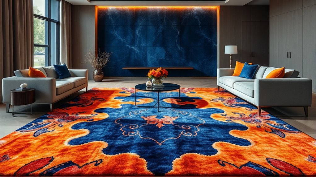
Deep blues and vibrant oranges create a striking visual contrast that instantly captures attention. This bold pairing leverages color psychology, where deep blue signifies trust and calm, while orange evokes energy and enthusiasm. Culturally, blue often symbolizes stability, and orange can represent warmth or spirituality. When combined, they generate a dynamic balance that energizes a space without overwhelming it. Visualize this contrast through the following imagery:
| Deep Blue | Vibrant Orange |
|---|---|
| Calm, serene ocean tones | Bright, fiery sunset hues |
| Trust-inspiring navy | Energetic tangerine |
| Sophisticated sapphire | Playful pumpkin |
| Cool twilight shades | Warm amber accents |
| Deep indigo | Bright coral accents |
This contrast creates a lively, engaging environment that emphasizes both color psychology and cultural symbolism. Incorporating color contrast techniques can further enhance the visual impact of these bold combinations, much like how targeted auditory processing strategies improve communication clarity. Additionally, understanding the emotional significance of colors in dreams can help in designing spaces that evoke specific feelings and moods. Recognizing how cybersecurity vulnerabilities can affect digital environments underscores the importance of creating secure and resilient design principles in both physical and virtual spaces.
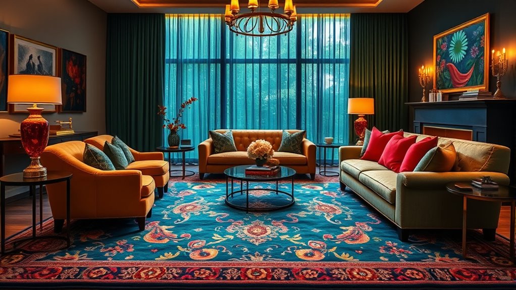
Pairing Rich Purples With Bright Yellows and Golds
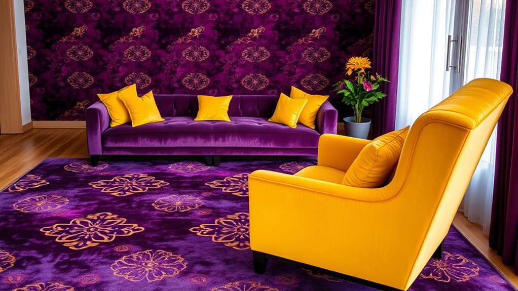
Building on the vibrant energy of contrasting hues, pairing rich purples with bright yellows and golds creates a regal yet lively palette that commands attention. Use color pairing techniques that emphasize balance—place a bold purple rug as a focal point and accent it with yellow or gold accessories to enhance the contrast. When choosing rug placement strategies, position the purple rug in central areas to anchor the room, allowing the bright yellows and golds in surrounding decor or furniture to radiate outward. This approach ensures the colors complement rather than compete. Incorporate these jewel tones thoughtfully to create visual harmony, making your space feel both sophisticated and energetic. Proper rug placement and strategic color pairing will elevate your decor, capturing the richness of this striking combination. Additionally, understanding color psychology can help you select hues that evoke specific moods and enhance the overall ambiance. Incorporating color theory principles can further guide your choices for a more balanced and impactful design. Exploring sound design techniques can also inspire creative ways to enhance your space’s atmosphere through subtle auditory elements. Integrating wall organization solutions can further highlight these vibrant tones and keep your space looking cohesive.
Balancing Emerald Greens With Reds and Pinks
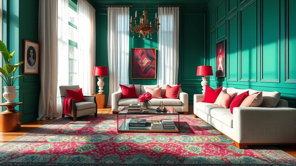
To create a balanced look, consider using vibrant red accents to make emerald green pop without overwhelming the space. Soft pink tones can add a gentle touch, ensuring harmony between bold and subtle elements. When you combine these hues thoughtfully, you achieve a vibrant yet balanced color scheme that feels cohesive and inviting. Incorporating color theory principles can further enhance your design choices. Implementing cookie consent management can help tailor your browsing experience to better suit your preferences. Additionally, understanding how color contrast affects visual harmony can make your space more appealing. Considering decorative accessories can also help unify the overall aesthetic and add texture to your design.
Vibrant Red Accents
Vibrant red accents can effectively create striking contrasts when paired with emerald greens, adding energy and visual interest to your color scheme. To make this pairing stand out, consider using color blocking techniques, placing bold red elements alongside lush emeralds for a dynamic look. Incorporate red as a focal point, such as in accessories or artwork, to energize the space without overwhelming it. Monochromatic schemes with varying shades of red can also add depth and sophistication, balancing the coolness of emerald green. Keep in mind that the key is to maintain balance—too much red can overpower, so use it sparingly for impact. This approach ensures your space feels lively, harmonious, and visually engaging. Additionally, understanding complementary color relationships can help you create a cohesive and inviting environment, especially when considering the color schemes that enhance visual harmony. Being mindful of spiritual symbolism can also influence your choice of accents, fostering a space that resonates positively on a deeper level.
Soft Pink Tones
Soft pink tones offer a gentle way to balance the richness of emerald greens and the boldness of reds. Incorporate pink hues through flower patterns on rugs or upholstery to create a soft, romantic contrast. Look for fabric textures like plush velvets or silky weaves that enhance the subtlety of pinks, adding depth without overpowering the space. These delicate shades work well with jewel-tone rugs, providing a calming counterpoint to vibrant greens and reds. Use pink accents sparingly to avoid overwhelming your design, focusing instead on how the softness complements the bolder colors. By choosing floral motifs and textured fabrics, you bring a sophisticated, layered feel that highlights the jewel tones while maintaining a balanced, inviting atmosphere.
Balance and Harmony
Achieving balance and harmony when combining emerald greens with reds and pinks requires thoughtful placement and proportion. Understanding color psychology helps you create a lively yet cohesive space, as reds evoke energy and warmth, while pinks add softness. Cultural symbolism also guides your choices, since emerald green often signifies growth and renewal, contrasting with the passionate symbolism of reds. To guarantee harmony:
- Use emerald green as a calming backdrop and reds or pinks for accent pieces.
- Balance bold rugs with neutral walls and furniture.
- Incorporate varying shades to avoid overwhelming the senses.
- Pay attention to proportion, keeping dominant colors in moderation for visual equilibrium.
This approach prevents discord and fosters a space that’s vibrant yet balanced, respecting both visual appeal and cultural significance.
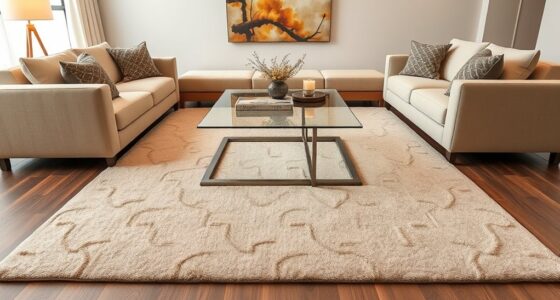
Accent Ideas for Enhancing Jewel-Tone Rugs
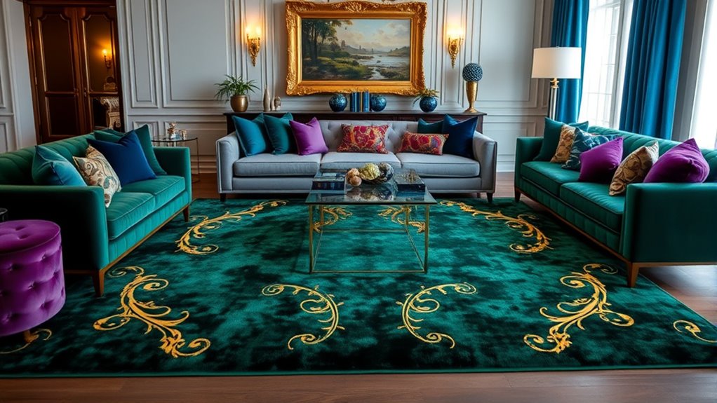
To make jewel-tone rugs truly stand out, consider adding bold accent pieces that complement their rich hues. Use color psychology to choose accents that evoke desired emotions; for example, gold or amber accents add warmth and luxury. Incorporate contrasting colors, like deep blues or emerald greens, to create visual interest. Interior lighting plays a vital role—warm lighting enhances the richness of jewel tones, making them appear more vibrant, while cool lighting can highlight their elegance. Mirrors with metallic frames, statement cushions, or artwork in complementary shades also elevate the space. Keep your accents intentional and balanced to highlight the rug’s beauty without overwhelming the room. Thoughtful accents will make your jewel-tone rug a mesmerizing focal point.
Tips for Achieving a Harmonious and Eye-Catching Space
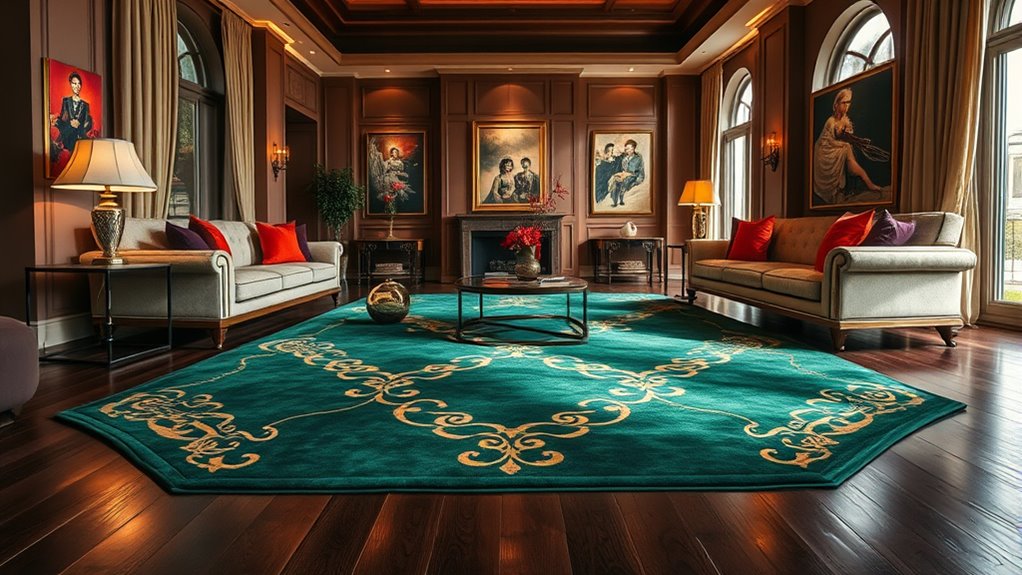
Building on your accent choices, creating a harmonious and eye-catching space involves balancing colors, textures, and furnishings. To do this effectively, consider color psychology to evoke the desired mood and energy. Proper furniture coordination guarantees your décor feels cohesive rather than chaotic. Here are some tips:
Create a balanced, cohesive space by blending colors, textures, and furniture thoughtfully.
- Use contrasting jewel tones with neutral walls to make colors pop.
- Incorporate varied textures to add depth without overwhelming the eye.
- Select furniture pieces that complement your rug’s colors and style.
- Keep a consistent color palette across accessories to unify the space.
Frequently Asked Questions
How Can I Incorporate Jewel-Tone Rugs Into Minimalist Interior Designs?
You can incorporate jewel-tone rugs into minimalist interiors by balancing color with neutral walls and simple furniture. Choose a rug as a statement piece, then select sleek, understated furniture to keep the space uncluttered. Focus on clean lines and minimal accessories to highlight the rug’s rich hues without overwhelming the room. This approach guarantees your jewel-tone rug becomes a focal point while maintaining the calm, streamlined aesthetic of minimalism.
What Are Common Mistakes to Avoid When Pairing Jewel Tones?
Imagine a room bursting with vibrant jewel tones—beautiful but easily overwhelmed. To avoid color clash, steer clear of overmatching your hues, which can create a dull, monotonous look. Instead, use contrasting shades thoughtfully, allowing each color to stand out. Be cautious with bold jewel tones, as too many can feel chaotic. Balance your palette with neutral accents, ensuring your space remains harmonious and visually appealing without overwhelming your senses.
How Do Lighting Conditions Affect the Appearance of Jewel-Tone Rugs?
Lighting impact plays a big role in how you perceive the color of jewel-tone rugs. In natural light, their rich hues may appear more vibrant, while dim or artificial light can dull their brilliance. You should consider the lighting conditions in your space because they directly influence color perception. Adjusting lighting can enhance or mellow the shades, helping you achieve the perfect look for your rug and overall decor.
Can Jewel-Tone Rugs Work Well in Small or Cluttered Spaces?
Did you know small spaces with jewel-tone rugs can feel more vibrant and lively? You can definitely make jewel-tone rugs work in tight or cluttered areas by focusing on space optimization and color contrast. Keep furniture simple and light-colored to balance the bold rug, and avoid overcrowding. This approach highlights the rug’s richness without overwhelming the room, creating a stylish, cozy atmosphere that feels larger and more inviting.
How Do I Maintain the Vibrancy of Jewel-Tone Rugs Over Time?
To keep your jewel-tone rug vibrant over time, you should focus on proper cleaning and maintenance. Regular vacuuming prevents dirt buildup, which can cause colorfastness issues, and promptly spot clean spills to avoid staining. Avoid harsh chemicals that may fade colors, and consider professional cleaning every year. This routine helps preserve the richness of your rug’s hues, ensuring it stays striking and beautiful for years to come.
Conclusion
By mastering the art of complementary color schemes with jewel-tone rugs, you reveal a world of vibrant, harmonious spaces. Think of your room as a canvas—each color a brushstroke—creating a masterpiece that’s both bold and balanced. Don’t shy away from contrast; embrace it. With these tips, you’ll craft a stunning environment that captures attention and invites admiration. After all, isn’t life too short for dull decor? Let your jewel tones shine!