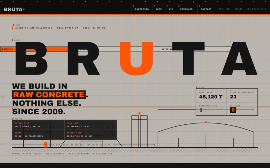
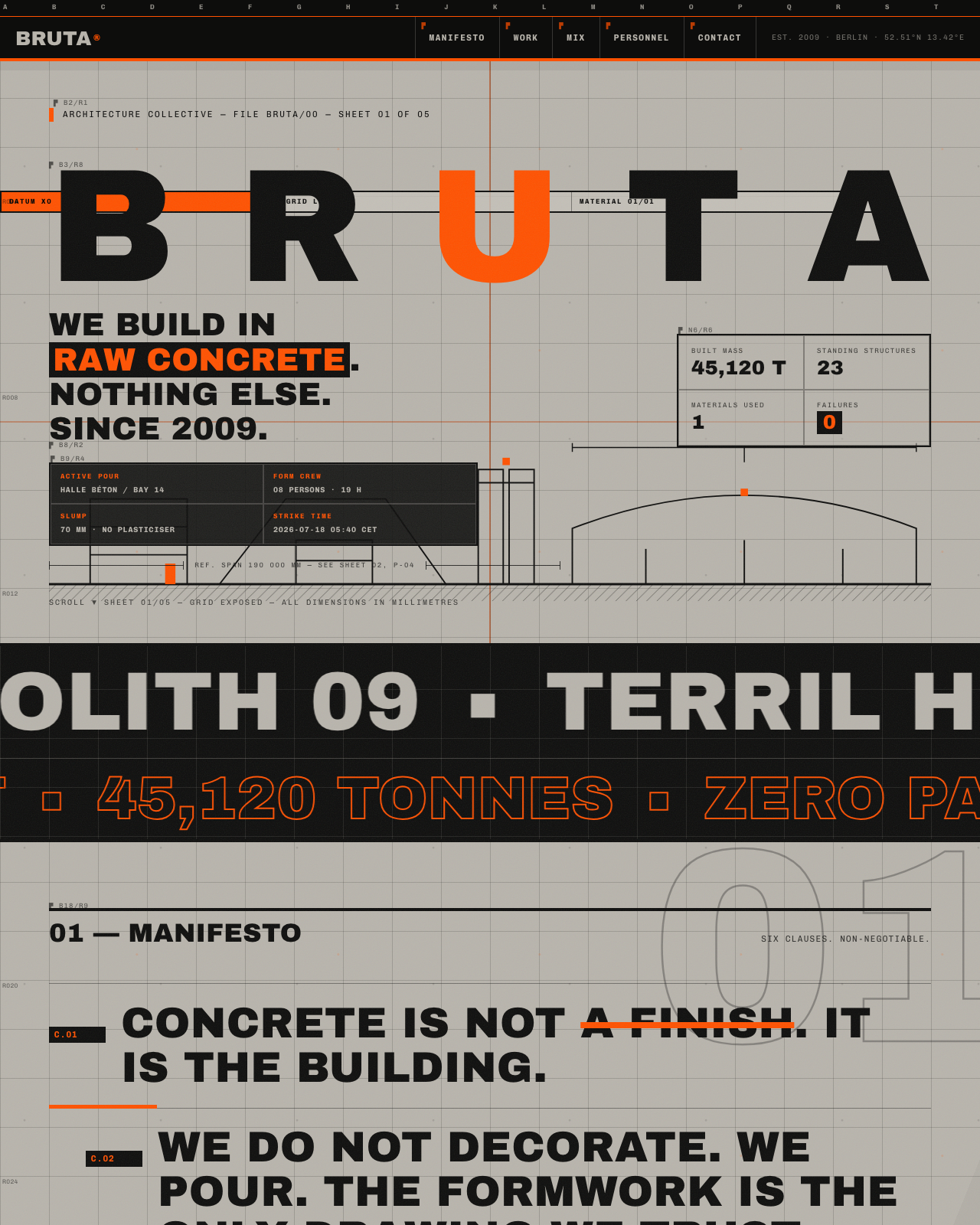
Imagine a digital space that embodies the raw, industrial spirit of a fictional Berlin architecture collective, BRUTA. This site is a meticulous construction sheet, revealing every detail of its design machinery rather than concealing it. Its core feature is a vividly exposed grid, a relentless rhythm that anchors the entire interface, turning the website itself into a virtual construction zone where every element aligns with an unforgiving concrete aesthetic.

Get furniture and decor delivered free with Prime
- Fast, free delivery on millions of items
- Prime Video, Amazon Music and more included
- Member-only deals all year
The site development follows a three-phase pipeline: initial build, rigorous critique, and final validation by an art director guided by the design manual. The build process hinges on a strict grid system, with gridlines layered into the background using CSS linear gradients, creating a tactile sense of structure. JavaScript functions measure and align elements precisely, maintaining phase-locking of background lines to ensure the grid feels physical rather than digital. Annotations are generated on-the-fly, reading element positions and transforming them into coordinate labels, further emphasizing the site’s architectural theme. After construction, the site undergoes a merciless critique to ensure every detail aligns with the brutalist ethos, culminating in a certification step that confirms the site’s fidelity to the raw concrete concept.
The full build notes live in the room’s design guide.
The visual palette is deliberately minimal, dominated by shades of concrete gray and punctuated by safety-orange datum fields. This is complemented by carefully chosen typefaces: Archivo Black for project headers and section titles, conveying solidity, and Chivo Mono for technical details and annotations, emphasizing clarity. The grid is not a mere guide but an integral part of the experience, constructed through layered CSS gradients that mimic the texture of aggregate flecks and linear gridlines. Interactive annotations are generated dynamically via JavaScript, reading element boundaries to produce coordinate tags that reinforce the site’s construction theme. The typographic and color choices work in concert with this grid, forging a cohesive aesthetic that feels like peering into a building’s blueprint.
Want this? Paste this into your AI coding agent
Build a single-page showcase website from this art-direction brief. Work like an elite creative frontend engineer; commit totally to the direction.
BRIEF (room 16 of 175, “bruta”):
BRUTA — architecture collective. Fiction: three architects who only build in raw concrete. Aesthetic: kinetic brutalism: concrete #b8b4ac (CSS noise texture), black, safety orange #ff5100. Fonts: archivo-black (massive display), chivo-mono (specs/metadata). SIGNATURE: the grid is EXPOSED — visible 1px gridlines across the whole page (background-image lines), elements snap to it and annotate themselves with coordinates (E4/R2) in tiny mono; oversized project marquees (100vw bands of repeating project names) scrolling opposite directions at different speeds; hover a project row -> entire row inverts to orange instantly (no transition — brutal); giant section numerals bleed off-canvas. Projects: 4 fictional concrete buildings with year/tonnage/coordinates; manifesto in shouting caps with underline strikes; team as monospace personnel files. Cursor: crosshair with coordinate readout. Unforgettable: aggressive, systematic, zero softness — and yet composed.STACK: pure HTML/CSS/JS, no build step, no frameworks, no CDNs or external requests of any kind; self-hosted fonts only; every visual is code (CSS/SVG/canvas/WebGL) — no image assets required.
QUALITY BAR: flawless at 390px, 834px and 1440px with zero horizontal overflow; tap targets >= 44px; semantic landmarks, focus-visible styles, body-text contrast >= 4.5:1; prefers-reduced-motion pauses or simplifies heavy animation; rAF loops pause when the tab is hidden; hold 60fps (cap particle counts, avoid layout thrash); rich invented content everywhere — real-sounding names, numbers and program notes, never lorem ipsum; orchestrate one beautiful staggered load moment plus scroll and hover surprises. FORBIDDEN: Inter/Roboto/Arial/system-ui, purple-gradient-on-white, and cookie-cutter hero+cards+footer layouts.
PROCESS: iterate in three documented passes — (1) build plus builder self-critique, (2) merciless external critique finding and fixing at least ten real problems, (3) art-director elevation from good to unforgettable. Screenshot at all three widths every pass and fix everything you can see.
— Original brief by Claude Fable 5 (art director), executed by the FABLE/175 pipeline.
— This room lives at https://fable-25-830.netlify.app/sites/bruta/
This is the verbatim art-direction brief that produced the room — exposed by the exhibition itself via the “Prompt” link in the room’s footer.
Experience the site firsthand by visiting the live exhibition, where the interactive grid and annotations come to life. Take a tour through all 175 project pages housed within this digital ‘construction yard’—each one a testament to the site’s architectural rigor, built entirely through AI-driven design techniques. Dive into this virtual construction zone and see how raw concrete and digital precision converge in a groundbreaking showcase of architectural expression.
Visit the live room → · Browse all 175 rooms
Previously in Wing I
- Room 6: Abyssal Station — a 3,800 m descent
- Room 15: Apothecarium — Bitters & Botanical Remedies, est. 1783
- Room 11: The Cartographer’s Society — est. 1831
FABLE / 175 is a finished exhibition of 175 fundamentally different websites, each built end-to-end by an AI. This article is part of our series walking through it room by room.
brutalist architecture coffee table
As an affiliate, we earn on qualifying purchases.
As an affiliate, we earn on qualifying purchases.
Halloween Picks
halloween
As an affiliate, we earn on qualifying purchases.