
To mix warm and cool neutrals without tension, choose a dominant neutral color and use the contrasting one as an accent for depth. Pay attention to undertones to create harmony, pairing opposite or adjacent hues thoughtfully. Distribute warm and cool elements evenly across the space, balancing wall colors with accents like rugs and art. Layer textures to add interest without overwhelming. Keep these principles in mind, and you’ll craft a cohesive, inviting look — more tips await if you continue exploring.
Key Takeaways
- Choose a dominant neutral color and use the contrasting neutral as an accent for balance.
- Ensure warm and cool neutrals have complementary undertones to create harmony.
- Distribute warm and cool elements evenly throughout the space to maintain visual equilibrium.
- Layer textures thoughtfully to add depth without overwhelming the color palette.
- Focus on cohesive color flow and balance textures to create an inviting, tension-free environment.
Blending warm and cool neutrals in your space might seem intimidating, but with the right approach, it can create a balanced and inviting atmosphere. The key is understanding how to achieve color harmony and employing effective balance techniques. When you mix these tones thoughtfully, you’ll avoid the tension that often arises from clashing shades, instead producing a cohesive, sophisticated look.
Start by selecting your dominant neutral color—the one that sets the overall mood. For instance, if you prefer a cozy, inviting feel, lean toward warm neutrals like beige, tan, or soft caramel. If you want a sleek, modern vibe, cool neutrals such as gray, taupe, or icy blues might be your choice. Once your main color is established, incorporate the contrasting neutral as an accent, ensuring it complements rather than competes with the primary hue. This contrast creates depth and interest without overwhelming the senses.
Color harmony plays an essential role here. You can achieve it through subtle undertones—warm neutrals often have hints of yellow or red, while cool neutrals lean toward blue or green undertones. When these are balanced well, they help your space feel unified instead of chaotic. To enhance this harmony, consider using a color wheel as a guide: pairing neutrals that sit opposite each other or are adjacent can create a pleasing visual flow. For example, pairing warm taupe with a cool slate gray can produce a refined, balanced look. Additionally, understanding how color undertones influence the overall palette can make a significant difference in your design success.
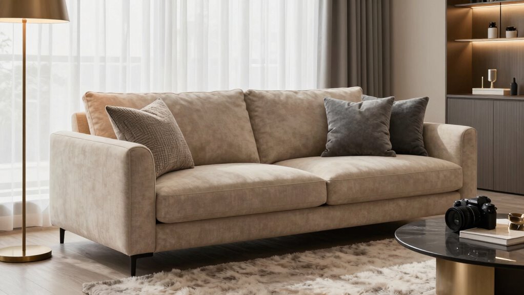
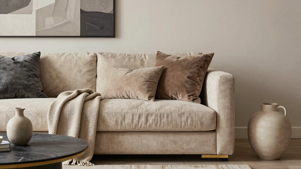
Balance techniques are fundamental in preventing the space from feeling disjointed. One effective method is to distribute warm and cool neutrals evenly across the room. If you’ve painted the walls in a warm tone, incorporate cool accents through furniture, accessories, or art. Conversely, if your walls are cool-toned, add warm elements like throw pillows, rugs, or curtains. This distribution helps your eye move comfortably around the room, maintaining visual equilibrium. Incorporating visual weight through different elements can further enhance this balance, ensuring no single area dominates. You might also consider texture layering to add depth and interest, which can subtly influence the perceived harmony of your space.
Layering different textures also enhances the equilibrium. Combining soft fabrics with sleek surfaces can emphasize the warmth or coolness of your neutrals, adding tactile interest that reinforces your color choices. Keep the overall palette restrained—too many variations can create confusion. Instead, stick with a few carefully chosen shades and let the textures do some of the work. This approach ensures your space remains harmonious and inviting.
Achieving harmony and balance is especially important because color harmony and contrast help prevent the space from feeling disjointed or chaotic. In the end, mixing warm and cool neutrals successfully hinges on your ability to create harmony and balance. With deliberate choices—paying attention to undertones, distributing colors thoughtfully, and balancing textures—you’ll craft a space that feels seamless and inviting, without the tension often associated with combining these tones.
neutral wall paint colors for living room
As an affiliate, we earn on qualifying purchases.
As an affiliate, we earn on qualifying purchases.
Frequently Asked Questions
Can Warm and Cool Neutrals Be Used Together in Small Spaces?
Yes, you can use warm and cool neutrals together in small spaces. Focus on achieving color harmony by balancing these tones thoughtfully. Incorporate texture contrast—like soft fabrics with sleek surfaces—to add visual interest without overwhelming the room. Keep the palette cohesive with subtle shifts between warm and cool neutrals, ensuring each element complements the other. This approach makes your small space feel inviting and well-designed without creating tension.
What Are the Best Accessories to Complement Mixed Neutrals?
You can elevate your space with accessories like layered textures and metallic accents that seamlessly blend warm and cool neutrals. Imagine a cozy throw with tactile richness paired with shimmering gold or silver decor pieces, adding depth and interest. These accessories create visual contrast without tension, making your room feel cohesive and inviting. Don’t be afraid to mix materials and finishes—this playful approach adds personality and warmth to your neutral palette.
How Do Lighting Conditions Affect Neutral Color Combinations?
Lighting conditions greatly influence how your neutral color combinations appear. Under natural daylight, warm neutrals might seem softer and more inviting, while cool neutrals can look crisp and revitalizing. Artificial lighting, however, can shift these tones—warm lighting enhances warmth, and cool bulbs emphasize cooler shades. You should test your neutral palette in different lighting scenarios to guarantee your desired mood remains consistent, whether in daylight or under artificial light.
Are There Specific Patterns That Work Well With Mixed Neutrals?
When mixing neutrals, think of patterns as your secret weapon—stripes and geometrics work well, creating a lively contrast without clashing. To achieve a harmonious look, focus on color balance by pairing warm and cool neutrals strategically. Keep pattern contrast in check by varying scale; larger patterns anchor the design, while smaller ones add interest. This approach guarantees your space feels cohesive and visually engaging, like a well-orchestrated symphony.
How Can I Update My Neutral Palette Seasonally?
To update your neutral palette seasonally, you can incorporate shades aligned with neutral color psychology, like soft beiges in winter and breezy taupes for summer. Use seasonal decorating tips, such as adding textured throws or fresh greenery, to refresh your space. Mix warm and cool neutrals thoughtfully, keeping harmony in mind, so your home feels balanced and inviting year-round. Subtle updates can make a big seasonal impact!
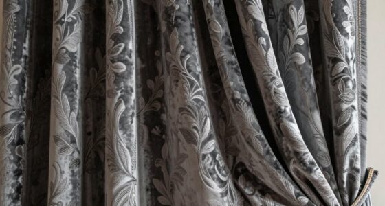
warm and cool neutral accent rugs
As an affiliate, we earn on qualifying purchases.
As an affiliate, we earn on qualifying purchases.
Conclusion
Think of mixing warm and cool neutrals like blending two harmonious melodies into a beautiful song. When you carefully tune each note—balancing warmth’s richness with cool’s crispness—you create a symphony that feels inviting and balanced. Embrace the subtle shifts and let each neutral play its part without overpowering the others. With patience and a keen ear, you’ll craft a space where warmth and coolness dance together in perfect harmony, inviting comfort and elegance into your home.
textured neutral throw pillows
As an affiliate, we earn on qualifying purchases.
As an affiliate, we earn on qualifying purchases.
neutral art prints for wall decor
As an affiliate, we earn on qualifying purchases.
As an affiliate, we earn on qualifying purchases.