
TL;DR

Get furniture and decor delivered free with Prime
- Fast, free delivery on millions of items
- Prime Video, Amazon Music and more included
- Member-only deals all year
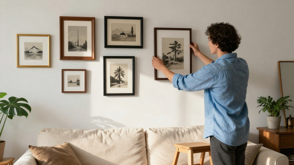
Toronto framing expert Tara Gavin says a gallery wall works best when it has a clear design direction. Her approach uses intentional frame and mat colors, varied photo placement and, in one family project, black-and-white prints to create cohesion.
Toronto framing expert Tara Gavin says gallery walls should be organized around a clear design direction, rather than assembled by simply placing framed pictures together. In advice reported by House Beautiful, the founder of On the Wall Framing describes using mat colors, frame finishes, spacing and photo placement to make collections feel deliberate and personal.
Gavin’s examples include a gallery wall she curated for a Toronto family of five with design studio Kessler Levitan. The available wall was only 31 inches wide, and she treated the limited space as a design feature. Instead of relying only on white mats and wood frames, she combined oak and black frames with burgundy-colored mats and frames.
Gavin says the colors served different purposes: burgundy added warmth, oak kept the display from feeling too formal, and black provided contrast—an approach that can pair well with gallery wall frame sets. She suggests choosing colors that relate to furnishings in the room, while noting that shades such as soft blue, olive green or a warm neutral can also change the feel of a photograph. These are design recommendations, not requirements for every gallery wall.
She also recommends treating the mat—the border between an image and its frame—as part of the composition, alongside picture lights for gallery wall art. Wider negative space can draw attention to a smaller photograph, while multiple images in one frame or a slightly off-center placement can make a layout less predictable. For collections of family photographs taken in different settings and lighting, Gavin says converting prints to black and white can help unify the display. In the project described, the photos were black and white while the mats and frames carried the color.
A Cohesive Display From Personal Photos
The advice offers a practical way to make a collection feel connected without requiring matching frames or a professional art collection. For readers displaying family photographs, the approach separates two design choices: images can share a consistent treatment, while frames and mats add color and variation. That can help a wall feel coordinated even when its photographs come from different years or settings.
Gavin’s narrow-wall project also shows how the method can be adapted to limited space. The source does not establish that these techniques work for every room or taste; it presents them as choices a framer uses to give a particular installation a coherent look. The central takeaway is to decide on an overall direction before selecting and arranging individual pieces.
Products Worth Considering

Philips Hue Large Smart Light Tube, Black – White and Color Ambiance LED Color-Changing Light – 1 Pack

Sonos Era 100 SL Compact Microphone-Free Speaker, Black

Ring Floodlight Cam 2K Wired Security Camera, 3-Pack, Black
As an affiliate, we earn on qualifying purchases.
The Choices Behind Gavin’s Layout
Gallery walls are a way to display multiple framed photographs and prints together. House Beautiful’s report focuses on Gavin’s process and three elements in the described work: an intentional palette, mats and spacing, and consistency in the photographs. The source does not give a full installation plan, such as exact measurements between frames or a hanging template.
Gavin’s approach does not depend on one fixed palette. In the featured project, familiar oak and black frames were combined with burgundy. She also says color can be coordinated with a prominent shade in the surrounding furnishings. For the photographs, black and white was used to reduce visual differences among family images, while the surrounding materials supplied color and contrast.
“My team and I love playing with scale, unexpected mat colors, different frame finishes, and the way photographs are positioned within a frame in order to keep them fresh.”
— Tara Gavin, founder of On the Wall Framing
Details Beyond the Design Advice
The report does not specify how the frames were measured, the distance between them, the installation hardware used or whether the wall was planned with a paper template. It also does not provide a complete list of the photographs or frame sizes in the Toronto project. Readers should treat the recommendations as Gavin’s design approach, not a universal formula or a guarantee that a particular palette will suit every interior.
Planning a Wall of Your Own
The source describes design principles rather than a scheduled follow-up or a new product launch. For someone planning a similar display, the next step suggested by Gavin’s advice is to choose a direction for the collection: decide whether the photographs will be color or black and white, identify a palette for frames and mats, then consider how negative space and image placement can support the arrangement. House Beautiful’s report does not provide additional updates or say whether Gavin has announced further projects.
Key Questions
What does Tara Gavin mean by a gallery wall having a design direction?
She recommends making deliberate choices about scale, mat colors, frame finishes and photo placement so the pieces read as a considered collection rather than unrelated frames.
Do gallery wall frames all need to match?
No. In Gavin’s Toronto project, oak, black and burgundy were combined. Her example suggests using different finishes can work when the choices support a shared palette.
Why use black-and-white family photographs?
Gavin says black-and-white printing can bring consistency to family photos made at different times and in different lighting. She presents it as an option, not a requirement.
How can mats change a gallery wall?
Mats create negative space around an image, which can give a small photograph more presence. Gavin also suggests using multiple openings in one frame or positioning an image off-center to vary the composition.
Source: housebeautiful.com