TL;DR

Get furniture and decor delivered free with Prime
- Fast, free delivery on millions of items
- Prime Video, Amazon Music and more included
- Member-only deals all year
Livingetc’s Style Pulse report for spring/summer 2027 identifies mint green as an emerging interior color, following its appearances in recent fashion collections and at Milan Design Week. Designers quoted in the report recommend using it selectively and balancing it with earth tones, deeper colors or warm accents. The report is a trend forecast, not evidence that the color is being adopted widely across homes.
Livingetc’s Style Pulse report for spring/summer 2027 identifies mint green as an emerging interior design color, with designers describing it as a fresh alternative to olives and sages. The report points to the shade’s appearances at Milan Design Week and in recent fashion collections, while recommending that homeowners use it in considered doses rather than treating it as a proven, widespread shift in decorating.
Livingetc describes mint as an “oxygenated green,” positioned between nature-inspired color and the brighter visual language of technology. Color expert Amy Moorea Wong, quoted in the report, links its futuristic feel to mid-century space-age palettes and contemporary screens and apps. She says its light pastel quality comes close to neon without the intensity of fluorescent color.
Livingetc editor Hugh Metcalf said he had seen the hue across designs at Milan Design Week. He described it as disruptive enough to bring energy to a scheme but softer than an acidic green. The report also notes mint in fashion: it appeared in Fendi’s Spring/Summer 2026 collection and in shoes from Matthieu Blazy’s first Chanel collection, then in accessories and clothing at Loewe’s 2027 spring ready-to-wear show.
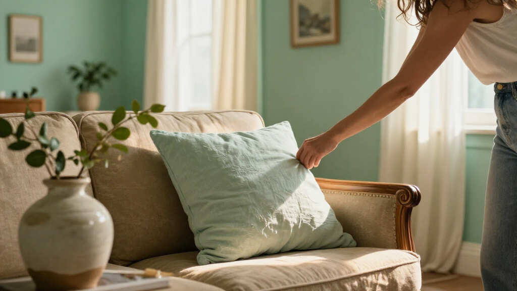
Designers featured by Livingetc offer different ways to bring the shade indoors. Samantha Hauvette of Paris-based Hauvette & Madani describes mint on an armchair as a deliberate accent that can connect with turquoise elsewhere in a room. Chicago designer Jennifer Sucher says she pairs saturated color with earth tones or muted dark shades; in one family room, burgundy artwork grounds a mint wall. The examples are individual design choices, not a survey of consumer decorating habits.
How Designers Are Using Mint
The report’s practical message is that mint can add a clear focal point without requiring a room to be built around a bright color. A lamp, chair, ceiling or other contained detail can give a room a lift, while surrounding materials and colors keep the effect balanced. That makes the forecast relevant to readers considering a change that is smaller than repainting an entire home.
Color pairings are central to the advice. Wong suggests testing colors from the red side of the wheel, including rust, rosy pink and cherry. Sucher’s example uses burgundy, while other projects described in the report place mint alongside turquoise, pink and terracotta. These are designers’ recommendations and examples; the report does not establish that any one combination is suitable for every space.
The setting may matter as much as the pairing. Color consultant Harriet Slaughter says mint can evoke the 1930s to 1950s and work well in bathrooms, kitchens and other light, bright rooms. Together, the advice frames mint as both a contemporary accent and a shade that can draw on retro references.
Products Worth Considering

Bose Lifestyle Ultra Wireless Home Speaker

Levoit Core 400S-P Smart Air Purifier for Large Rooms

LEVOIT Vital 200S-P Smart Air Purifier for Large Rooms
As an affiliate, we earn on qualifying purchases.
From Runways to Room Schemes
The report situates mint within a broader change in green’s popular shades. It says olives and sages have been prominent recently, while mint is now being presented as a newer direction for SS27. This is Livingetc’s editorial forecast for an upcoming season, rather than an independently measured market trend or a claim that previous green shades are disappearing.
Fashion appearances supply part of the report’s rationale: mint featured in Fendi’s Spring/Summer 2026 collection, Chanel footwear and Loewe’s 2027 spring show. Metcalf’s account of seeing the color at Milan Design Week adds an interiors-industry observation. The examples show visibility across design settings, but they do not by themselves establish how common mint is in homes or retail sales.
For interiors, the designers’ examples point to more than one route. A small object can punctuate a warm palette; a larger surface such as a wall or ceiling can make the color a defining feature. The report presents these as project-specific applications, including a mint ceiling shaped by the Art Deco character of one building.
““Its light-filled pastel teeters on the brink of a bright, almost neon, which makes it feel weightless, synthetic, and unearthly.””
— Amy Moorea Wong, color expert, as quoted by Livingetc
Forecast, Not Market Data
The source presents mint green as a trend forecast for SS27, supported by design-industry observations, runway examples and interviews. It does not provide sales figures, consumer polling or data measuring how many households are choosing the color. The breadth and staying power of the trend therefore remain unclear.
It is also not clear whether mint will be used mainly as a small accent or become more common on walls, ceilings and larger furnishings. The projects in the report show several approaches, but they are illustrative examples rather than a representative sample. Whether the shade will appeal beyond design-conscious audiences is not established by the material provided.
Whether the Color Spreads
The next indicators will be how mint appears in interiors collections, designer projects and other seasonal forecasts as spring/summer 2027 approaches. The Livingetc report does not announce a product launch or provide a timetable for any wider market change.
For readers considering the color now, the designers’ suggestions are to start with a contained accent, test combinations against existing finishes and use deeper or earthy tones to balance stronger applications. These are styling recommendations from the cited designers, not a guarantee that a particular palette will suit every room.
Key Questions
Why is mint green being highlighted for 2027 interiors?
Livingetc’s SS27 Style Pulse report identifies it as an emerging shade after appearances at Milan Design Week and in recent fashion collections. The report describes it as a fresh alternative to olives and sages, but does not provide market data proving broad adoption.
How do designers recommend using mint green at home?
Several designers quoted by Livingetc suggest using it as a deliberate accent, such as on a chair, lamp or ceiling. Larger applications also appear in the examples, but the report does not prescribe one approach for every home.
What colors can be paired with mint?
Amy Moorea Wong suggests rust, rosy pink and cherry. Other examples in the report combine mint with burgundy, turquoise, pink or terracotta, while Jennifer Sucher recommends balancing saturated colors with earth tones or muted deep shades.
Is mint green already a widespread home-decor trend?
The source establishes that designers and fashion collections have featured the shade, not that it is widespread among homeowners. It provides no consumer survey or sales data, so the scale of adoption remains unknown.
Source: livingetc.com