
TL;DR

Get furniture and decor delivered free with Prime
- Fast, free delivery on millions of items
- Prime Video, Amazon Music and more included
- Member-only deals all year
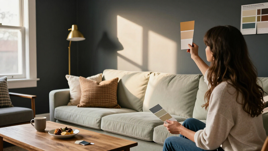
A House Beautiful report asked interior designers which colors they would avoid using across living room walls. The designers named green-yellows, stark grays or whites, bright reds and a client’s favorite color, while stressing that context, lighting and paint finish matter and no hue is universally wrong.
A House Beautiful report asked interior designers which paint colors they would avoid for living rooms, and the answers focused on specific conditions rather than a universal ban: green-yellows under artificial light, stark grays or whites, and bright reds across large areas. The designers also cautioned against making a favorite color the room’s permanent backdrop, arguing that lighting, furnishings and finish can change how a color feels.
Interior designer Meghan Shadrick said there are not necessarily “bad” living room colors, but some choices are more likely to miss the mark. She favors light, balanced neutrals as a backdrop, leaving room for bolder colors or wallpaper elsewhere. Her specific warning was about green with strong yellow undertones: when evening artificial lighting becomes the room’s only light source, she said, bulbs can push the color further toward yellow and make it look unpleasant.
Brooke Mennen-Talsma, principal designer at Brooke MT Interiors, cautioned against cool grays that look stark or flat, along with whites that can read similarly. She said she prefers muted, “muddy” colors for a more lived-in effect. Shadrick described bright reds as potentially overwhelming over large wall areas, though she uses red as an accent or in smaller, cozy rooms.
Designer Blair Burton offered a different kind of caution: she said she typically avoids using a client’s favorite color as the main wall color. In her view, a large, permanent block of that shade can constrain the rest of the room. She instead suggests bringing it in through textiles, a chair, art, a rug or pillows. The designers also discussed high-sheen finishes: Mennen-Talsma and Burton favor lower-sheen walls, which they say draw less attention to imperfections and provide a softer setting for furnishings and art. They suggested that trim or millwork can take more sheen for contrast and easier cleaning.
How Lighting and Finish Change Color
The report is useful to people planning a repaint because it frames color choice as a question of how a room is used and lit, not a simple list of forbidden shades. A paint chip viewed in daylight may not show how a yellow-leaning green will look under evening bulbs, while a high-sheen finish can make wall flaws more visible. Considering those conditions before buying paint may help homeowners avoid a costly repaint or a room that feels different from what they expected.
The advice is design guidance, not a tested rule. The designers’ comments reflect their experience and preferences; the report does not establish that any color will consistently produce the same effect in every home. Room orientation, bulb color, existing furniture and personal taste can all affect the result.
As an affiliate, we earn on qualifying purchases.
The Designers’ Color-by-Color Advice
The article’s overall framing is cautious: there is no single color that every living room must avoid. Shadrick’s preference for balanced neutrals is intended to give a room flexibility, rather than prohibit bold choices. Her warning about green-yellows depends on the undertone and evening lighting, not on every shade of green.
The other recommendations are similarly conditional. Mennen-Talsma objects to grays and whites that appear too cool, stark or flat, not necessarily every gray or white. Shadrick said red can work in smaller, cozy rooms or as an accent. Burton’s advice concerns where a favorite color appears, suggesting it can feature in furnishings and decor rather than dominate the walls. The report also treats paint sheen as a separate decision from color selection, with lower sheen preferred for the main walls and more sheen considered for trim.
““By choosing something light and balanced, it allows you to play with bolder paint colors or wallpaper elsewhere.””
— Meghan Shadrick, interior designer
No Universal Color Ban
The report does not identify a universally unsuitable living room color, and its designers’ views are personal professional judgments rather than findings from a comparative study. It also does not specify the exact paint shades, bulb temperatures, room orientations or wall conditions behind each example. Those details can affect whether a color reads warm, cool, flat or vivid.
The source provides no publication date, and it does not report how many designers were consulted beyond the people quoted in the supplied material. Readers should treat the recommendations as starting points, not guarantees about how paint will look in a particular home.
Test the Shade in Your Room
The article does not announce a follow-up study or a scheduled next development. For anyone considering a repaint, the practical next step suggested by the designers’ comments is to check the color in the room’s actual lighting and consider both undertone and sheen before committing. Samples viewed at different times of day can help show how daylight and evening bulbs affect the appearance.
Homeowners can also decide whether a strong favorite shade belongs on every wall or might work better in a rug, chair, artwork or other removable element. The report’s advice leaves the final choice to the resident: test the paint, evaluate the finish and judge it in the space, rather than treating any color as automatically wrong.
Key Questions
Which living room paint colors did the designers caution against?
They pointed to green-yellows with strong yellow undertones, stark grays or whites, and bright reds over large areas. Their cautions depend on the room and the specific shade; they did not say those colors are always unsuitable.
Why might a green-yellow paint look different at night?
Meghan Shadrick said artificial evening light can make green-yellows look even more yellow, which she finds unflattering. The effect will depend on the paint and the lighting in the room.
Did the designers say that neutral colors are always best?
No. Shadrick said light, balanced neutrals can provide a flexible backdrop, but the report stresses that there are no universally bad living room colors. The right choice depends on the home and the desired look.
Why did one designer caution against painting a room in a favorite color?
Blair Burton said a favorite color used across the walls can make other choices in the room respond to that dominant backdrop. She suggested using the shade in textiles, furniture, art or accessories instead.
What paint finish did the designers prefer for living room walls?
Brooke Mennen-Talsma and Blair Burton favored lower-sheen finishes for walls, saying they create a softer appearance and draw less attention to imperfections. They suggested using more sheen on trim or millwork for contrast and easier cleaning.
Source: rss
Halloween Picks
halloween
As an affiliate, we earn on qualifying purchases.