
TL;DR

Get furniture and decor delivered free — and shop member deals
- Fast, free delivery on millions of items
- Access to Prime Big Deal Days deals on October 6–7
- Prime Video, Amazon Music and more included
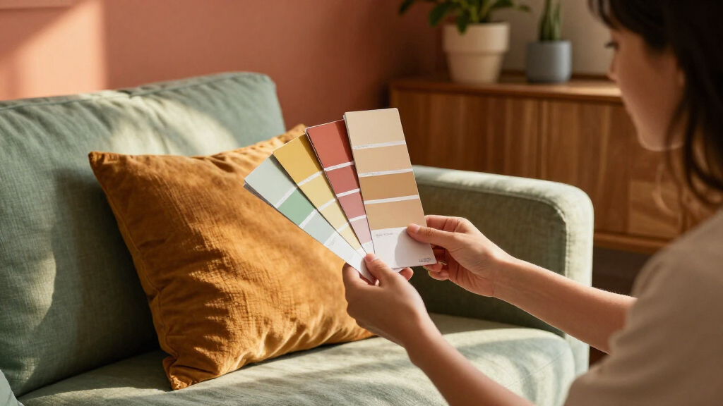
Paint and interiors specialists cited by Veranda forecast 10 color directions for 2027, including grounded roses, nuanced browns, stone-based neutrals, complex blues, warm pastels, earthen oranges, mature yellows, mossy greens, periwinkle and wine. These are expert projections, not confirmed outcomes or a single industry-wide forecast; the source ties them to nostalgia, nature and a desire for more personal, expressive interiors.
Paint and interiors experts are forecasting 10 color directions for 2027, led by grounded roses, nuanced browns and complex blues, according to a report by Veranda. The projections point toward palettes influenced by natural pigments, nostalgia and more personal choices, but they are forecasts rather than evidence that these colors will be used everywhere.
The 10 families identified in the report are grounded roses, neutral browns, stone-based neutrals, complex blues, warm pastels, earthen oranges, mature yellows, mossy greens, periwinkle and wine. The report describes a move away from straightforward, familiar versions of some colors toward shades with layered undertones and closer links to clay, minerals, plants and other natural references.
Examples include C2 Paint’s Pueblo, a rose shade combining mauve, brown and pink undertones, and Graham & Brown’s Rose Earth, inspired by soft clay deposits in Italy. Dunn-Edwards named French Press its 2027 Color of the Year; the company describes it as a brown with a subtle plum undertone. Little Greene’s Marle combines ochre and black undertones, while the report also highlights stone-based neutrals as companions to richer colors.
The report’s account of Sherwin-Williams’ forecast links the palette to a desire for rooms that feel more individual and energetic, alongside continued interest in memories and nature. It does not offer survey data, sales figures or a standardized measure of how widely any color is being adopted.
A More Personal Palette for Homes
For readers planning a renovation or choosing paint, the forecasts offer a snapshot of what designers and color businesses are discussing ahead of 2027. The range includes deep, layered shades as well as warm pastels and balanced neutrals, rather than prescribing one dominant color for every room.
The underlying idea is that color choices can connect to personal memories and places, not only to fashion cycles. That may help explain why the forecast pairs nostalgic references with less conventional combinations. It remains a matter of taste, however: expert projections do not establish that a shade will suit every home or become broadly popular.
As an affiliate, we earn on qualifying purchases.
How Experts Read Color Shifts
Veranda’s report says color and paint specialists expect nostalgia and nature to keep influencing interiors in 2027. It describes natural pigments, flora and minerals as reference points, while also noting inspiration from travel, childhood homes and antique textiles. In that framing, familiar colors return in altered, more layered forms.
Color of the Year selections and forecast collections provide examples of what brands are putting forward, including French Press, Marle, Pueblo and Rose Earth. These are company announcements and expert opinions, not a shared industry standard. The supplied report excerpt gives detailed descriptions for some families, but does not provide equal detail on all 10.
“There is something distinctly human about Pueblo. It refuses to be just one thing.”
— Philippa Radon, interior designer and C2 Paint color specialist
Forecasts, Not Market Results
The report presents expert expectations, not measured proof that these hues will be “everywhere” in 2027. The supplied material does not include polling, paint-sales data, adoption rates or a method for comparing the popularity of the 10 families. It also does not specify a publication date for the report.
Some claims describe individual brands’ products and forecasts, while broader statements about consumer preferences are attributed to experts. It remains unclear how those projections will compare with actual choices by homeowners, designers and manufacturers during 2027.
Watch for Adoption in 2027
The next evidence of how these projections fare will come from design projects, product launches and consumer choices over the year. Readers can also look for further forecast announcements from paint and interiors companies. The report does not identify a shared follow-up date or a single industry body that will track whether the predictions come true.
For now, the list is best read as a set of expert-led possibilities, with particular attention to layered rose and brown shades, balanced stone neutrals and more expressive color choices. Actual popularity remains to be seen.
Key Questions
What are the 10 color trends forecast for 2027?
The report lists grounded roses, neutral browns, stone-based neutrals, complex blues, warm pastels, earthen oranges, mature yellows, mossy greens, periwinkle and wine. They are expert projections, not confirmed market outcomes.
Which brown shades do experts expect to see?
The report describes browns with layered plum, olive or gray undertones, rather than a single warm brown. Examples include Dunn-Edwards’ French Press and Little Greene’s Marle.
Why are personal memories part of the forecast?
The report says experts see people drawing inspiration from travel, childhood homes and antique textiles, as well as from nature and design trends. That explanation is attributed to the report’s sources, not presented as a quantified survey result.
Are these colors guaranteed to be popular in 2027?
No. They are forecasts by color and interiors experts. The supplied report includes no sales figures or adoption data confirming how widely the shades will be used.
Source: rss
Halloween Picks
halloween
As an affiliate, we earn on qualifying purchases.