TL;DR
This article provides a detailed, expert-backed guide to choosing the right pale colors for your kitchen. It emphasizes starting with fixed elements and building a connected, timeless palette. The advice aims to help homeowners create cohesive, practical, and stylish kitchens.
Choosing the right pale color scheme for a kitchen can transform the space into a bright, cohesive environment. Experts emphasize starting with fixed elements like countertops and flooring to inform color choices, making the process more manageable and ensuring harmony.According to designers, selecting a kitchen color scheme should begin with the room’s permanent features, such as countertops, flooring, and appliances, which influence the overall palette. These fixed elements often carry undertones and patterns that guide the choice of wall and cabinet colors. For example, a marble countertop with blue-gray veining might lead to cooler wall tones, while warm-toned wood floors suggest earthy hues. Once the fixed elements are identified, the dominant color—usually the cabinetry—is chosen to set the mood of the space. Experts recommend considering how colors will reflect natural light and the atmosphere you want to create, whether calm and cocooning or bright and energetic. Building a supporting palette involves layering complementary tones and finishes to add depth and interest, avoiding overly trendy choices for timeless appeal. The process is designed to make decision-making more logical and less overwhelming, helping homeowners create kitchens that are both functional and aesthetically cohesive.
Why Cohesive Pale Colors Matter in Kitchen Design
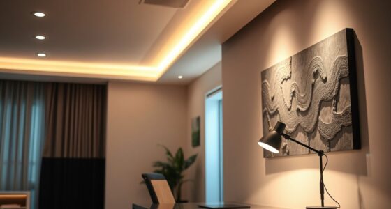
Choosing a well-coordinated pale color palette enhances the kitchen’s aesthetic appeal, making the space feel larger, brighter, and more inviting. It also ensures longevity, as carefully selected shades can age gracefully and complement various design elements. Properly integrated colors improve the overall harmony, reducing the risk of costly mistakes. For homeowners, understanding how to build a connected palette simplifies decision-making and results in a more personalized, timeless kitchen that aligns with their lifestyle and home’s architecture.

Rust-Oleum 372007 Transformations Basics Cabinet & Trim Paint, Quart, Pure White, 32 Fl Oz (Pack of 1)
Ideal for transforming old, outdated cabinets in kitchens, bathrooms, offices and more
As an affiliate, we earn on qualifying purchases.
As an affiliate, we earn on qualifying purchases.
The Role of Fixed Elements in Kitchen Color Planning
Designers stress that the most permanent features—countertops, flooring, and appliances—should guide the initial color choices. These elements have undertones and patterns that influence the overall palette. Historically, many homeowners overlook this step, leading to mismatched or less cohesive designs. The approach of starting with fixed features has gained popularity as a practical method to streamline decision-making and ensure harmony. This strategy aligns with professional design practices that prioritize building a connected, layered palette from the room’s core materials, rather than starting with paint chips alone.
“Before we look at a single paint chip, we look at the ‘soul’ of the home. This leads us toward the color palette naturally—whether moody pastels or bold jewel tones.”
— Alissa Pulcrano, founder of Bright Designlab

Giani White Marble Epoxy Countertop Small Project Kit
Giani Countertop Paint is a simple, three-step application that will transform Formica, laminate, Corian, ceramic tile, butcher block,…
As an affiliate, we earn on qualifying purchases.
As an affiliate, we earn on qualifying purchases.
Uncertainties in Selecting the Ideal Pale Palette
It is not yet clear how specific pale shades will perform in different lighting conditions or how trends might influence timelessness. Variations in room architecture and natural light can alter how colors appear, making final choices somewhat subjective. Additionally, individual preferences for warmth or coolness in pale tones can vary widely, and the long-term durability of certain finishes remains uncertain. More research is needed on how different materials age and interact over time with pale colors.

Nexus Self Adhesive 12-Inch Vinyl Floor Tiles, 20 Tiles – 12" x 12", Medium Oak Plank-Look Pattern – Peel & Stick, DIY Flooring for Kitchen, Dining Room, Bedrooms & Bathrooms by Achim Home Decor
Nexus Vinyl Tiles: Refresh your home for a low cost and no hassle with the Nexus Vinyl Floor…
As an affiliate, we earn on qualifying purchases.
As an affiliate, we earn on qualifying purchases.
Next Steps for Homeowners Choosing Kitchen Pale Colors
Homeowners should start by analyzing their fixed elements and gathering samples that reflect their preferred tones. Consulting with a professional designer can help refine choices and ensure cohesion. As trends evolve, staying informed about new materials and finishes that complement pale palettes will be beneficial. The next phase involves testing selected colors in natural lighting conditions and finalizing finishes before committing to large-scale painting or remodeling projects.
Multilingual Cool Summer Palette Color Fan by Studio Immagine, Personalized Color Guide for Cost Saving, Smart Shopping, Outfit & Wardrobe Planning; Verano Frio/Verao Frio
FOUND YOUR COLOR IDENTITY — NOW WHAT?
As an affiliate, we earn on qualifying purchases.
As an affiliate, we earn on qualifying purchases.
Key Questions
How do I choose a pale color that won’t look dull over time?
Opt for shades with subtle undertones and layered finishes that add depth. Consulting with a professional can help identify timeless hues that age well.
Should I match my cabinet color to my countertops?
Not necessarily. Instead, choose a dominant color for cabinets that complements the undertones in your countertops, creating harmony without perfect matching.
How can lighting affect my pale color choices?
Natural and artificial lighting can significantly change how pale colors appear. Testing samples in your kitchen’s lighting before finalizing is recommended.
Are trendy pale colors a good long-term choice?
Trends can be fleeting. Opting for classic, versatile shades with layered textures tends to ensure longevity and timeless appeal.
Source: Homes & Gardens