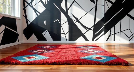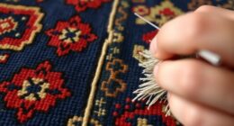
In luxury interiors and rugs, color influences mood and perception. Red energizes spaces and conveys passion or power, while blue creates calm and trust. Green inspires renewal and connection to nature, and neutral tones add elegance and serenity. Gold and metallics highlight luxury, black and charcoal bring depth, and warm earth tones foster comfort. Bright colors add vibrancy and playfulness. Exploring these color strategies helps you craft emotionally resonant, sophisticated environments—continue to uncover how to master color for your space.
Key Takeaways
- Colors like red, blue, and green evoke specific emotions such as passion, tranquility, and renewal, influencing the mood of luxury interiors.
- Metallics and gold accents enhance perceived opulence, signaling wealth and sophistication through reflective and striking details.
- Neutral tones provide timeless elegance and balance, allowing textures and patterns in rugs and décor to stand out effectively.
- Bright, vibrant hues add energy and playfulness, creating lively, dynamic spaces that stimulate creativity and social interaction.
- Thoughtful color choices, combined with textures and motifs, craft environments that evoke feelings of trust, luxury, comfort, and cultural significance.
The Impact of Red: Evoking Passion and Energy
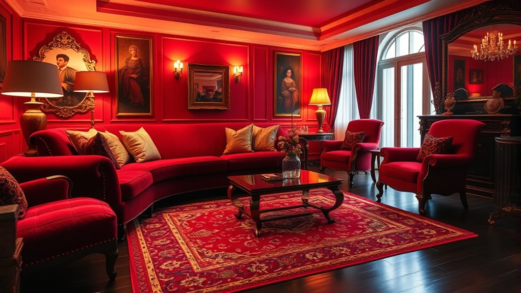
Red has a powerful ability to evoke passion and energy in interior spaces, making it a popular choice for those seeking to create an invigorating atmosphere. Its psychological effects are immediate, often increasing heart rates and stimulating excitement, which can boost motivation and confidence. Culturally, red symbolizes luck, power, and prosperity in many societies, adding layers of meaning to its use. When incorporated into luxury rugs and décor, red can energize a room while also conveying strength and opulence. Understanding psychological effects allows you to harness red’s full potential, creating spaces that feel vibrant, passionate, and culturally resonant. However, it’s important to use red thoughtfully, as its intensity can become overwhelming if overdone.
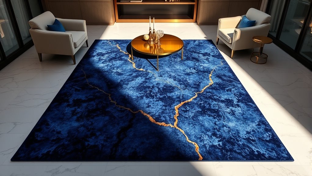
Blue Tones: Creating Calm and Trustworthy Spaces
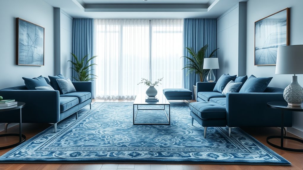
Blue tones are renowned for their ability to foster a sense of calm and trust in interior spaces. When you incorporate these shades into your décor, you create soothing interiors that promote relaxation and mental clarity. Light blue hues evoke serenity, making your rooms feel open and inviting, while darker navy tones add a layer of sophistication and stability. Using blue in your luxury rugs and furnishings can help establish a trustworthy ambiance, especially in areas meant for conversation or reflection. These colors work well in bedrooms, offices, or living rooms, where a tranquil environment enhances comfort. By thoughtfully selecting blue tones, you guarantee your space exudes both calmness and reliability, creating an atmosphere that’s both welcoming and dependable. Additionally, incorporating elements inspired by beach destinations can enhance the relaxing vibe of your interiors.
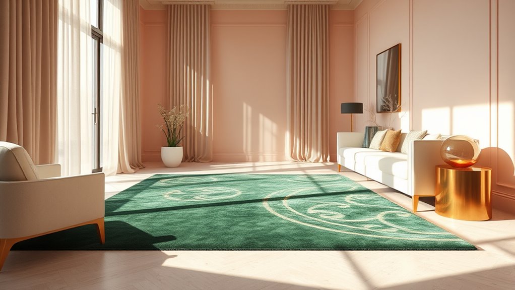
Green Hues: Balancing Nature and Renewal
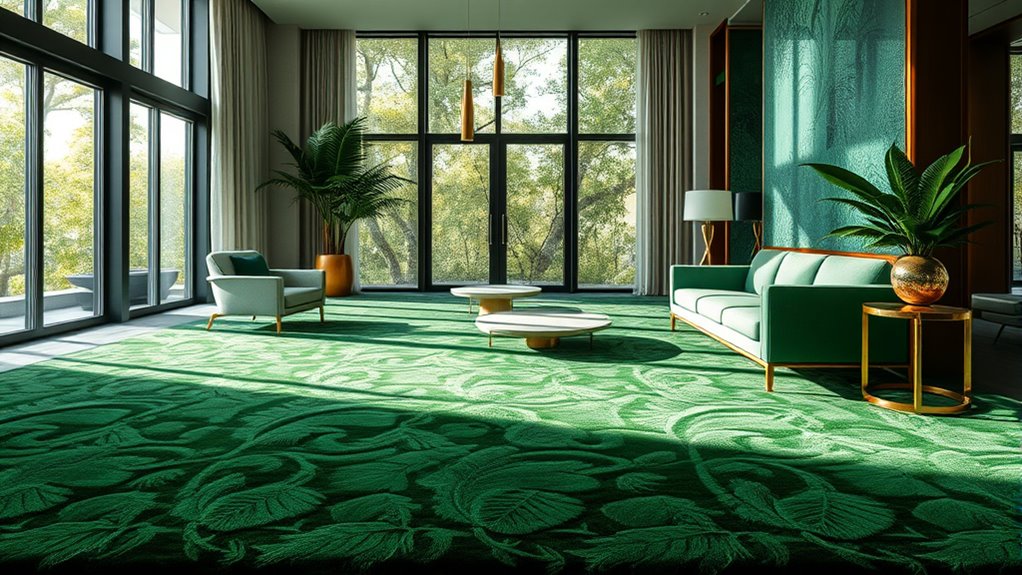
Green hues naturally evoke feelings of renewal and harmony, making them a powerful choice for creating balanced and revitalizing interiors. They inspire nature-inspired designs that foster a sense of tranquility and freshness. When incorporating green, imagine lush foliage, moss-covered stones, or delicate fern patterns woven into luxurious rugs. Using eco-friendly materials enhances this connection to nature, emphasizing sustainability. Visualize:
- Soft moss drapes over furniture
- Vibrant leaf motifs in intricate patterns
- Earthy tones blending seamlessly
- Organic textures that invite touch
- Subtle olive and sage accents
These elements combine to create a space that feels both revitalized and grounded. Incorporating eco-friendly materials further deepens this natural connection and supports sustainable design choices. Green hues foster a calming atmosphere, perfect for renewal, while supporting eco-conscious choices in your interior design.
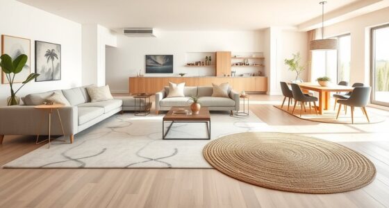
Neutral Shades: Establishing Sophistication and Serenity
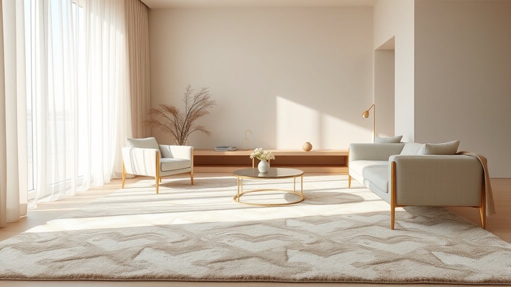
Neutral shades bring a timeless elegance and balance to your space, creating a foundation that feels both refined and welcoming. They foster a calm, serene atmosphere that adapts effortlessly to different styles and moods. Incorporating these hues allows you to craft a sophisticated environment that exudes tranquility and versatility. Additionally, neutral tones serve as a perfect backdrop for seasonal accents and bold accessories, enhancing their visual impact without overwhelming the overall design.
Timeless Elegance and Balance
Neutral shades play an essential role in creating a sense of timeless elegance and balance within luxurious interiors. They serve as a perfect backdrop, allowing other design elements to shine through while maintaining harmony. When you incorporate neutral tones, you enhance color contrast subtly, highlighting textures and patterns without overwhelming the space. This balance fosters visual harmony, making your environment feel serene and sophisticated. Picture a plush beige rug grounding a room with crisp white walls, or soft taupe accents blending seamlessly with dark wood furniture. The understated elegance of neutral shades ensures your space remains versatile and enduring. With careful selection, these hues elevate your interior’s aesthetic, creating a refined atmosphere that exudes both grace and tranquility. Regularly assessing and organizing space can help maintain this sense of order and serenity over time.
Calm and Versatile Atmosphere
Building on the sense of timeless elegance, neutral shades create a calm and versatile atmosphere that transforms your space into a serene retreat. These tones foster subtle color progressions that enhance depth without overwhelming, allowing your decor to shine. Neutral shades also work seamlessly with ambient lighting effects, softening shadows and emphasizing the room’s tranquility. They provide a sophisticated backdrop that adapts effortlessly to different styles and moods, whether you want a peaceful haven or a refined setting. Incorporating wall organization systems can further enhance the aesthetic appeal and functionality of your space. By choosing these hues, you establish a foundation of serenity and elegance that’s both inviting and adaptable. This versatility guarantees your space remains balanced, calming, and effortlessly stylish, making neutral shades the perfect choice for cultivating an atmosphere of relaxation and refinement.
Gold and Metallics: Conveying Luxury and Prestige
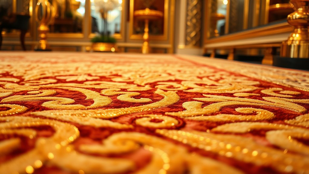
Gold and metallics instantly evoke a sense of luxury and prestige, transforming ordinary spaces into opulent retreats. They serve as powerful tools in luxury branding, signaling wealth and sophistication. Incorporating metallic accents in your decor creates a striking visual impact, elevating the overall ambiance. Imagine shimmering surfaces that catch the light, adding depth and elegance. Visualize:
- Gleaming gold frames framing artwork or mirrors
- Metallic rugs with reflective fibers enhancing texture
- Brass or gold fixtures complementing rich fabrics
- Metallic pillows adding subtle shimmer
- Gold leaf details on furniture or accessories
These elements craft a sense of exclusivity and grandeur. When used thoughtfully, gold and metallics communicate prestige, making your interior feel refined and timeless. They’re essential for creating spaces that radiate opulence and high-end appeal. Incorporating metallic accents can also enhance the perception of quality and craftsmanship in your interior design.
Purple and Lavender: Adding Regal Elegance and Creativity
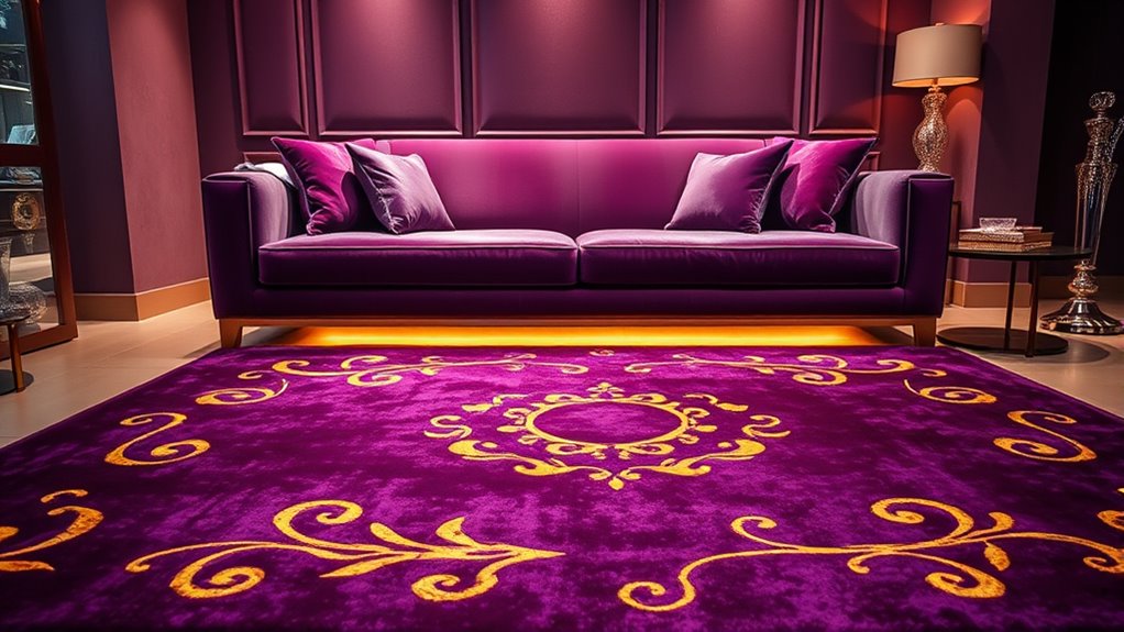
Purple and lavender instantly bring a sense of regal sophistication and timeless style to your space. These hues also spark your creativity and inspire your imagination, making your interiors more dynamic. Incorporating them thoughtfully can elevate your environment with both elegance and artistic flair.
Regal Sophistication and Style
When you incorporate shades of purple and lavender into your luxury rugs and interiors, you instantly elevate the space with a sense of regal sophistication. These colors carry powerful color symbolism and cultural associations that evoke elegance and authority. Imagine:
- Rich velvet textures that shimmer with royal grandeur
- Ornate patterns reminiscent of historic palaces
- Subtle lavender accents adding a touch of understated luxury
- Deep purple hues creating a commanding focal point
- Delicate lavender details hinting at creativity and refinement
- The use of color psychology in interior design can further enhance the emotional impact of these hues.
Inspiring Creativity and Imagination
Have you ever noticed how shades of purple and lavender spark your imagination and inspire new ideas? These colors carry strong symbolism related to creativity, wisdom, and inspiration, making them perfect for stimulating your mind. Purple’s richness and lavender’s softness create a compelling color contrast that energizes your space without overwhelming it. This contrast draws attention and encourages innovative thinking, making your environment a fertile ground for new projects or artistic pursuits. Incorporating purple and lavender into your interiors not only adds regal elegance but also activates your creative flow. Whether through rugs, accents, or textiles, these hues subtly push you toward original ideas and fresh perspectives, transforming your space into a sanctuary for imagination and innovation.
Black and Charcoal: Enhancing Depth and Modernity
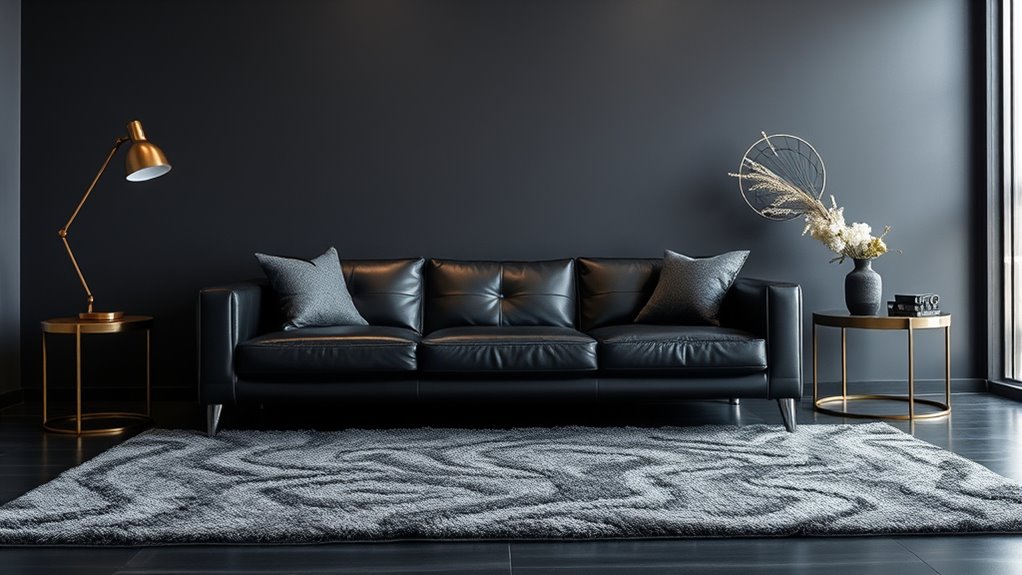
Black and charcoal hues are powerful choices for creating depth and a sleek, modern aesthetic in luxury interiors. They add sophistication and a bold statement, making spaces feel both timeless and contemporary. Incorporating black accents draws the eye and grounds your design, while charcoal textures introduce subtle contrast and richness. Imagine:
- Sharp, black furniture pieces with matte finishes
- Charcoal rugs with plush, textured surfaces
- Sleek black fixtures blending seamlessly into the background
- Dark, smoky walls that add mystery and depth
- Accents of black decor for a refined touch
These elements work together to enhance the room’s dimension, making your space appear more layered and intentional. Black and charcoal shades elevate your interior, creating an atmosphere of understated elegance and modernity. Additionally, automation technologies are increasingly being used to optimize design processes, ensuring precision and consistency in achieving your desired aesthetic.
Warm Earth Tones: Fostering Comfort and Coziness
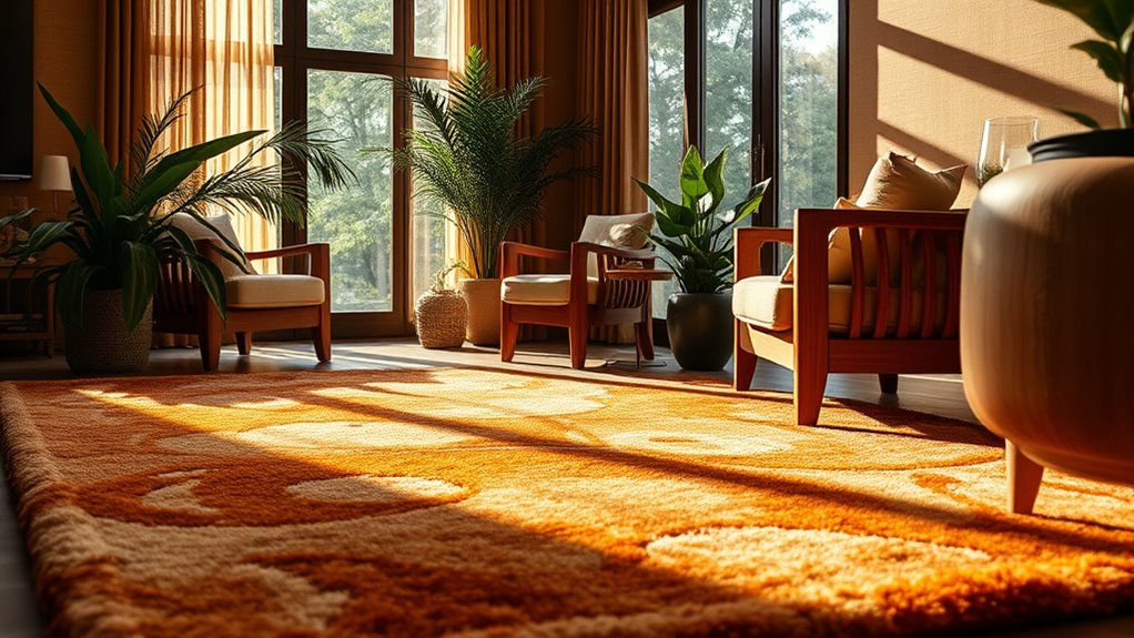
Warm earth tones, such as rich browns, soft beiges, and muted terracottas, instantly create a welcoming and cozy atmosphere in luxury interiors. These colors evoke feelings of stability and comfort, making your space feel inviting. Incorporating varied textile textures, like plush rugs or woven throws, enhances this sense of coziness and adds tactile richness. Additionally, warm earth tones carry cultural symbolism—signifying connection to nature, tradition, and heritage—that can deepen your interior’s storytelling. When used thoughtfully, these hues foster a serene environment where relaxation comes naturally. They serve as a perfect foundation for layering different textures and cultural accents, creating a harmonious and intimate space. Warm earth tones truly make your interior feel grounded, warm, and effortlessly elegant.
Bright and Vibrant Colors: Infusing Playfulness and Dynamism

Bright and vibrant colors can instantly energize your space, making it feel lively and inviting. They introduce a sense of playfulness and movement that transforms ordinary interiors into dynamic environments. By choosing these hues thoughtfully, you can create a bold statement that reflects your personality and zest for life.
Energizing Spaces With Bright Hues
When you incorporate vibrant hues into your space, you instantly introduce a sense of playfulness and energy. Bright colors stimulate the psychological effects that boost mood and motivation, making your environment feel lively. They also carry cultural symbolism that can evoke particular emotions or traditions, depending on the hue. To energize your space visually, imagine:
- A fiery red rug that sparks passion and warmth
- Electric blue accents that inspire creativity
- Sunny yellow cushions radiating optimism
- Lime green details invigorating freshness
- Hot pink touches adding a playful punch
These colors, when thoughtfully combined, create a dynamic atmosphere that feels vibrant and engaging. By understanding their psychological effects and cultural symbolism, you can select hues that not only energize but also reflect your unique style and personality.
Creating Playful, Dynamic Environments
Vibrant colors do more than energize a space—they also create a playful, dynamic environment that sparks curiosity and joy. You can achieve this by using color blocking techniques, combining bold hues in distinct sections to add visual interest. Playful patterns, like geometric shapes or organic motifs, further enhance the sense of movement and fun. These design elements make your space feel lively and inviting, encouraging interaction and spontaneity. Incorporate bright, contrasting colors in rugs and accessories to emphasize the playful atmosphere. By intentionally mixing vibrant shades with dynamic patterns, you craft an environment that feels spirited and engaging. This approach not only energizes the space but also invites exploration, making your interior a lively reflection of personality and creativity.
Color Combinations: Harmonizing for Visual Impact
Achieving a harmonious color combination is essential for creating visually impactful luxury rugs and interiors. Using complementary color schemes helps balance contrast and harmony, making your space feel vibrant yet cohesive. To visualize, imagine:
- Warm golds paired with deep blues, creating a regal contrast
- Soft blushes combined with rich emeralds, blending elegance and freshness
- Neutral grays accented with bold reds, adding energy without overwhelming
- Creamy beiges matched with dark browns for subtle sophistication
- Bright turquoise with burnt orange, offering lively visual interest
Frequently Asked Questions
How Do Cultural Differences Influence Color Choices in Luxury Interior Design?
Cultural differences greatly influence your color choices in luxury interior design. You’ll find that cultural symbolism shapes what colors resonate, while regional preferences guide your selections to suit local tastes. For example, you might choose red in China for luck or white in Western cultures for purity. By understanding these cultural nuances, you can create spaces that feel personalized and respectful of diverse backgrounds, elevating your interior’s overall elegance and meaning.
What Psychological Effects Do Pastel Colors Have in Upscale Spaces?
You’ll find that pastel palettes create a calming atmosphere in upscale spaces, fostering relaxation and comfort. These soft colors are known for mood enhancement, making your environment feel welcoming and sophisticated. By incorporating pastel shades, you invite serenity and elegance, which can elevate your space’s ambiance. You’ll notice that subtle hues not only soften the aesthetic but also positively influence your mood, making your luxury interior more inviting and peaceful.
How Can Color Psychology Improve the Resale Value of Luxury Homes?
You can boost your luxury home’s resale value by applying color psychology through thoughtful color harmony. When you select colors that evoke positive emotional impact, like calming blues or inviting neutrals, you create appealing spaces that attract buyers. This strategic use of color enhances the overall ambiance, making your home feel more inviting and sophisticated, ultimately encouraging higher offers and quicker sales.
Are There Specific Colors That Promote Productivity in Luxury Office Interiors?
Imagine a morning sunrise—warm yellows and soft blues blending seamlessly. These color combinations promote productivity by symbolizing energy and calm, creating an environment where focus flourishes. Using strategic hues like green for balance or blue for tranquility can boost mood enhancement, encouraging clarity and motivation. In luxury office interiors, these colors help you stay inspired and efficient, transforming your workspace into a sanctuary of both elegance and productivity.
How Does Lighting Affect the Perception of Color in High-End Rugs and Interiors?
Lighting critically influences how you perceive color in luxury rugs and interiors. It affects shade contrast and enhances color harmony, making certain hues appear more vibrant or subdued. When you choose lighting carefully, you can highlight the richness of your decor, emphasizing subtle color nuances. Proper lighting ensures that your space feels cohesive, allowing your high-end rugs and furnishings to showcase their true beauty and sophisticated elegance.
Conclusion
Understanding color psychology helps you craft luxurious, inviting spaces. Did you know that 85% of consumers say color influences their purchasing decisions? By thoughtfully choosing hues, you can evoke emotions like passion, calm, or sophistication, elevating your interior design. Whether you opt for bold reds or soothing blues, mastering color balance makes your space more appealing and memorable. So, trust your instinct and let color transform your luxury rugs and interiors into true work of art.